Jupiter In False-color Ultraviolet ©

Jupiter in false-color ultraviolet ©
More Posts from Artrosear and Others

I'm obsessed with the way different architectural styles reflect different aspects of God.
Like, gothic? The spires and the stained glass and the pointed arches? The gargoyles on the outside of churches, signifying that the demons can't enter into a sacred space? It's grand, almost foreboding. It sings in the piercing, ethereal song of the dryads of old, "He is not safe, but He is good."

And then there is romanesque, and it is God as fortress, God as bulwark. Round arches, heavy stones. Sturdy, safety, support. It sings in low Gregorian chant, "God is my strong tower, my refuge."

And then there is Baroque. And your breath stalls in your throat, and your heart does something strange because, oh—oh this must be what heaven looks like. It's dazzling, marvelous, almost a dream. And its song is not in words because there are no words to express it except "Sanctus, sanctus, sanctus." But its chorus is celestial all the same. It is God as Divine Beauty, the source from which all beauty flows.


ok wait, reblog if you’ve cried at least once because of math, doesn’t matter which grade i’m trying to prove something

...that your audience won't hate.
This is a method I started using when NFTs were on the rise - thieves would have to put actual work into getting rid of the mark - and one that I am now grateful for with the arrival of AI. Why? Because anyone who tries to train an AI on my work will end up with random, disruptive color blobs.
I can't say for sure it'll stop theft entirely, but it WILL make your images annoying for databases to incorporate, and add an extra layer of inconvenience for thieves. So as far as I'm concerned, that's a win/win.
I'll be showing the steps in CSP, but it should all be pretty easy to replicate in Photoshop.
Now: let's use the above image as our new signature file. I set mine to be 2500 x 1000 pixels when I'm just starting out.
Note that your text should not have a lot of anti-aliasing, so using a paint brush to start isn't going to work well with this method. Just use the standard G-Pen if you're doing this by hand, or, just use the text tool and whichever font you prefer.
Once that's done, take your magic wand tool, and select all the black. Here are the magic wand settings I'm using to make the selections:

All selected?

Good.
Now, find a brush with a scattering/tone scraping effect. I use one like this.

You can theoretically use any colors you want for this next part, but I'd recommend pastels as they tend to blend better.
Either way, let's add some color to the text.

Once that's finished,
You're going to want to go to Layer Property, and Border Effect

You'll be given an option of choosing color and thickness. Choose black, and go for at least a 5 in thickness. Adjust per your own preferences.

Now create a layer beneath your sig layer, and merge the sig down onto the blank layer.


This effectively 'locks in' the border effect, which is exactly what we want.
Hooray, you've finished your watermark!

Now let's place that bad boy into your finished piece.

You'll get the best mileage out of a mark if you can place it over a spot that isn't black of white, since you'll get better blending options that way. My preference is for Overlay.


From here, I'll adjust the opacity to around 20-25, depending on the image.

If you don't have a spot to use overlay, however, there's a couple other options. For white, there's Linear Burn, which imho doesn't look as good, but it still works in a pinch.

And for lots of black, you have Linear Light

Either way, you're in business!
EDIT since this has escaped my usual circles, and folks aren't as familiar with my personal usage:
An example of one of my own finished pieces, with watermark, so you can see what I mean about 'relatively unobtrusive'-- I try to at least use them as framing devices, or let them work with the image somehow (or, at the very least, not actively against it).

I know it's a bummer for some people to "ruin" their work with watermarks, which is part of the reason I developed this mark in particular. Its disruption is about as minimal as I can make it while still letting it serve its intended purpose.
There's other methods, too, of course! But this is the one I use, and the one I can speak on. Hope it helps some of you!
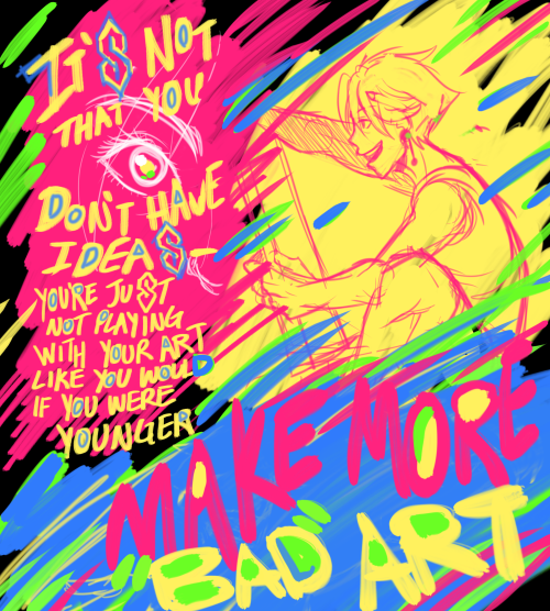
"Take chances, make mistakes, get messy!"- Ms. Frizzle Learn how to be bored again, boredom propagates creativity Be ok with 'ugly' art


#sonic isn't the shadow of this sibling dynamic
a writing competition i was going to participate in again this year has announced that they now allow AI generated content to be submitted
their reasoning being that "we couldn't ban it even if we wanted to, every writer already uses it anyway"
"Every writer"?
come on


I M P O S S I B L E
Late Easter post in Tumblr! I’ve been itching to post this. And I still don’t want this weekend to be over, to be honest. Faber Castell and Simbalion Watercolors on Hue & Ai Mix Media paper. Update: Someone recently reposted my art without crediting me, so I updated my watermark.
I think the moral of this story is that I can do all things through Christ who strengthens me but especially when I also have a banger of a playlist on my side
-
 corvidcorgi liked this · 1 month ago
 -
 direquail reblogged this · 1 month ago
 -
direquail liked this · 1 month ago
-
 rnanqo reblogged this · 1 month ago
 -
 jackassrabbit liked this · 1 month ago
 -
 onefleshonepod reblogged this · 1 month ago
 -
 rabarbarzcukrem reblogged this · 1 month ago
 -
 atleastitwasntmeth liked this · 1 month ago
 -
rabarbarzcukrem liked this · 1 month ago
-
 ghoulifikacja reblogged this · 1 month ago
 -
 glowingsaints liked this · 1 month ago
 -
 leforetenchante reblogged this · 1 month ago
 -
 confidentialonly liked this · 1 month ago
 -
 blueiscoool liked this · 1 month ago
 -
 limetimes57 reblogged this · 1 month ago
 -
 hreog liked this · 1 month ago
 -
 dullhare liked this · 1 month ago
 -
 sunburstsol liked this · 1 month ago
 -
 wachsurfer2018 reblogged this · 1 month ago
 -
wachsurfer2018 liked this · 1 month ago
-
 angelofvenuss liked this · 2 months ago
 -
 kyytheecancer liked this · 2 months ago
 -
 cityslicker7 reblogged this · 2 months ago
 -
cityslicker7 liked this · 2 months ago
-
 serpientesuenos reblogged this · 2 months ago
 -
 dragonflythriller reblogged this · 2 months ago
 -
dragonflythriller liked this · 2 months ago
-
 mutualmango liked this · 2 months ago
 -
 ki-ket reblogged this · 2 months ago
 -
ki-ket liked this · 2 months ago
-
 recurringflyingdream liked this · 2 months ago
 -
 damianurl liked this · 2 months ago
 -
 cherry-gloss reblogged this · 2 months ago
 -
cherry-gloss liked this · 2 months ago
-
 damestamp reblogged this · 2 months ago
 -
damestamp liked this · 2 months ago
-
 fata-carabina reblogged this · 2 months ago
 -
 m1acp reblogged this · 2 months ago
 -
 sleeponarooftop liked this · 2 months ago
 -
 isabelladonnaxxx liked this · 2 months ago
 -
 deemon67 liked this · 2 months ago
 -
 myrealurlis-ithvka liked this · 2 months ago
 -
 syngoniium liked this · 2 months ago
 -
 shmingleping liked this · 2 months ago
 -
 riarnu reblogged this · 2 months ago
 -
riarnu liked this · 2 months ago
-
 f3ijoas reblogged this · 2 months ago
 -
 cloudbeam reblogged this · 2 months ago
 -
cloudbeam liked this · 2 months ago
-
 ruralobserver liked this · 2 months ago

💙Christian💙24✨Digital/Traditional Artist✨🎵Music Creator🎶☁️Professional Daydreamer🫧NO politics allowed | NO hostile/rude behavior | NO AI. Human artists/art only!🪐Current Hyperfixation💫~Fields of Mistria~
57 posts