Comic Pages Storyboard Tutorial
Comic Pages Storyboard Tutorial
OKAY SO! @biazerod asked me a little help on storyboarding and i decided to make this tutorial…i’m not a professionist. so don’t take these as golden rules…just advices! and as always sorry for the english FIRST THING FIRST! the storyboard part is the most important phase in a comic page ! you can spend an entire day storyboarding! because it’s the structure, the essence of the page! here’s some tips : 1- a page can start from 1 panel/frame (called splash page!) until how many f*cking panels you can fit ! (some pages , especially in french comics/bd can reach 24 panels/frames!) Exaple of splash pages:


(these are from the green lantern,DC and the newest Thor ,marvel ) Splash pages are a priority of American comics, you rarely can find them in french Bd ! they represent a scene of impact! a fight! a revelation! be careful! use it only one if two times on a range of 50 pages! cuz it cut the narration! instead in french bd you find this :


first one is from Blacksad 2# and second one is from Atar Gull see how high the number of the frames is?? the number of frames is very important in a page because it decide the narration time! :D also it all depends on the kind of ‘’direction’’ you want to use on your comic! so be really careful when you decide the number of the frame! LET’S PASS ON THE CREATION! 1- when you have a page that contains more than 3 Frames ALWAYS. ALWAYS HAVE AN ESTABLISHING SHOT!

the establishing shot is fundamental! BECAUSE READERS CAN UNDERSTAND WHERE THE CHARACTERS ARE! DON’T DO A COMIC PAGE FULL OF FACES !

DON’T DO THIS! LET THE CHARACTER BREATH! LET THE READER BREATH! PLAY WITH YOUR CAMERA! YOU HAVE THE POWER! in a comic page, is important to put the camera far away from the character most of the time! play with the different shots!

(found this on google) WATCH MOVIES AND TV SHOWS. lot of them can help you so much you have no idea! a comic artist and a director do the same job when creating a story 2- Candy eye this is a tricky trick that can help you with the audience! when a character is saying something important or you have to introduce them , USE THE CANDY EYE DUDE.

the candy eye is , basically, a bust shot where you show the character,their features , usually with a cool or a funny expression ( or of course it depends from the situation) and believe me WORKS 10/10 with the audience ;) 3- HIGHLIGHTS THE IMPORTANT SCENE IN THE PAGE!

FINAL TIPS: - when you’re doing dinamic poses try and try again! the first one isn’t always the best! -USE REFERENCES. -A STORYBOARD PAGE CAN REQUIRE EVEN 4 HRS IF NOT AN ENTIRE DAY IF NOT AN ENTIRE WEEK. REMEMBER THAT THE STORYBOARD IS THE ESSENCE. AND THE REST IS DECORATION. - IMAGINE THE SEQUENCE! NOT THE SINGLE PAGES. THINK IN SEQUENCES! imagine what would happen after the page you are creating! connect the various pages NOT THE SINGLES FRAMES ! YOU’RE CREATING A STORY! NOT A SINGLE ILLUSTRATION! -AGAIN DON’T DO PAGE OF FACES. most important thing:

if the page you’re creating it stresses you! STOP. continue it when you are in a better mood ,dude. our job requires lot of time and effort, but it should be the job we love. so don’t stress yourself and keep calm. hope this is useful. don’t take this as golden rules, this is just the way i work :)
More Posts from Arttuti and Others
hi! you draw really nice hands, could you give some tips/make a tutorial?
sure!! this is quick and i dont have much of a method so?
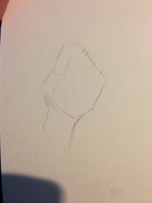
i kinda start out with a box shape for the palm and make some tic marks to plan out where the fingers go
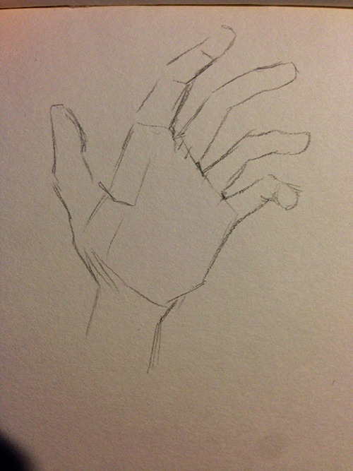
then box out some fingers
and darken out the details!
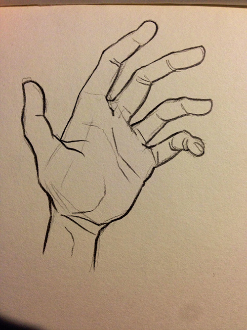
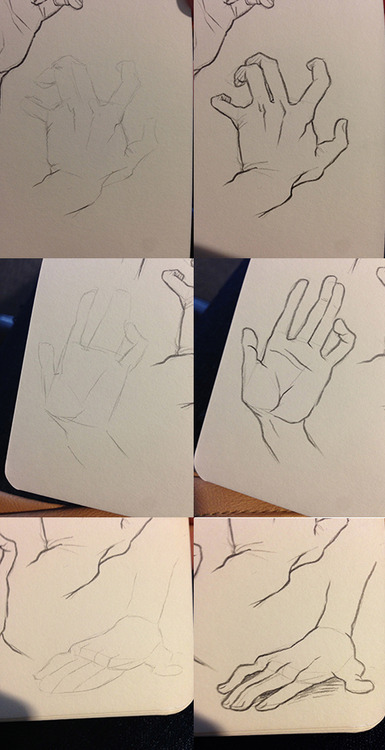
here’s some more examples too!! i always like to exaggerate the position of the thumb and pinky to make the pose of the hand more interesting?? give it more character? it’s a hand

In ain’t one to draw a perspective grid and then place figures in it; it’s never worked for me. So here’s my method!


Ay yo binch, how you draw teeths so good. They look great

Thanks! :^)
Usually I just start by filling in the mouth (all black since I mostly sketch in black and white) and then I use an eraser to make the shapes for the insides of the mouth (teeth, tongue). Since Ruby has monster-ish teeth, I draw them pretty sharp.

Draw different shapes and fill them in!

Cuddles reference sheet by *Kibbitzer
Cuddles for everybody! If you’re interested on Patreon you can find the complete series and all the normal and special reference sheets for 5$ per month! use it for your exercises if you need it XD Patrons or not, thanks for supporting me! ^A^/ <3 Facebook Deviantart

So I got a lot of messages after my first post asking me to explain layers, so I have put together a cheat sheet of the different layer types. The quickest way to become awesome with layers is to know exactly what each one does. Once again, I’m no expert, and these are just my personal definitions, so please try these out for yourself! LONG POST BELOWWW THE LAYERS CHEAT SHEET PART ONE: 1. NORMAL: Aw yeah you know all about this layer its just your average layer 2 DISSOLVE: This mode “dissolves” some pixels, allowing the lower layer to show through. very pixel-y. Reducing opacity makes it dissolve more. ________ 3. DARKEN: Now the difference between darken and multiply are a little confusing, so I will explain them together. MULTIPLY is more of a glaze, while DARKEN favors the darks on all layers. So if you have a darken layer on, it tend to reduce/remove the lighter tones on the layer if there are darker tones below it, while darkening the darks. 4. MULTIPLY: A glaze that darkens the color of the layer below. It is great for shading. Reduces whites. 5. COLOR BURN: “Burns” the lower layer favoring a more saturated look. Marks made over white are not preserved. 6. LINEAR BURN: “Burns” the lower layer, with a little less saturation than color Burn. Also will preserve colors over white. 7. DARKER COLOR: I tend to avoid this puppy cause it does not darken on the RGB channel. (feel free to try him though!) ______ 8. LIGHTEN: Lightens the colors below. Favors lighter colors on lower layers. 9. SCREEN: Lightens the colors below, but much closer to the “glaze” analogy as above. Reduces blacks. 10. COLOR DODGE: Often used for magic-y effects, color dodge bumps up saturation and is very bright. 11. LINEAR DODGE: Much like color dodge, but less saturation. 12. LIGHTER COLOR: Once again, this is an outside RGB channel layer, so I don’t really use this. As you probably have noticed, the second two groups are opposites, so if you have a good handle on one, you probably know exactly what the second group does! I will do the remaining groups next week as they do not follow this pattern. Thanks! drawmaevedraw.tumblr.com EDIT: Part two here: Photoshop Layers Part Two!!
-
 mellokie liked this · 3 weeks ago
 -
 xsolar-ghost reblogged this · 2 months ago
 -
 boredbunnii liked this · 2 months ago
 -
 corporal-ravioli reblogged this · 3 months ago
 -
 themrj8 liked this · 3 months ago
 -
 illogical-punk liked this · 4 months ago
 -
 artking-4 reblogged this · 4 months ago
 -
 erynia14th liked this · 6 months ago
 -
 herc18 liked this · 6 months ago
 -
 shineynotesfornobody reblogged this · 6 months ago
 -
 shineyreblogbog reblogged this · 6 months ago
 -
shineynotesfornobody liked this · 6 months ago
-
 nirtonic reblogged this · 6 months ago
 -
 rivster101 liked this · 7 months ago
 -
 artrefo reblogged this · 8 months ago
 -
 awkwardqueercreature liked this · 8 months ago
 -
 sparklewolfglitch liked this · 10 months ago
 -
artking-4 reblogged this · 11 months ago
-
 ilovespringysomuchlol reblogged this · 1 year ago
 -
 fuzzypatrolfancowboy liked this · 1 year ago
 -
 diagarunaaa reblogged this · 1 year ago
 -
 twadi-gurl reblogged this · 1 year ago
 -
 patar-fuifui liked this · 1 year ago
 -
 quin-ta-sential reblogged this · 1 year ago
 -
twadi-gurl reblogged this · 1 year ago
-
twadi-gurl reblogged this · 1 year ago
-
 mababwion liked this · 1 year ago
 -
 blog2835 liked this · 1 year ago
 -
 bill-cipher-yt reblogged this · 1 year ago
 -
 volcanion liked this · 1 year ago
 -
 reachforstrikhedonia liked this · 1 year ago
 -
 sproutmo reblogged this · 1 year ago
 -
 signofthefloss reblogged this · 1 year ago
 -
signofthefloss liked this · 1 year ago
-
 shanaraharlyah reblogged this · 1 year ago
 -
 laecandraw reblogged this · 1 year ago
 -
laecandraw liked this · 1 year ago
-
 mipelaz liked this · 1 year ago
 -
 ohtoriao reblogged this · 1 year ago
 -
 spookiat reblogged this · 1 year ago
 -
 sahara-silver reblogged this · 1 year ago
 -
sahara-silver liked this · 1 year ago
-
 the13thtrashlemur liked this · 1 year ago
 -
 celestialsqyd reblogged this · 1 year ago
 -
celestialsqyd liked this · 1 year ago
