A Couple Snippets From A Presentation I Gave At School This Past Week On Storyboarding!!
![Title card reading: [Storyboarding Basics. Brought to you by NU Animation Club, March 23 2023]. There is a chibi drawing of Feeb drawing on a CINTIQ](https://64.media.tumblr.com/1bb4994121212e48c92ee88de5cbe45d/8f6b9c73271b12ac-28/s500x750/efeaa63ce1f755c3643a35f0973a68f1f1057236.png)


a couple snippets from a presentation i gave at school this past week on storyboarding!!
‼️DISCLAIMER: I am still a student and have only worked on student and indie projects! This is just stuff that I personally find helpful as an amateur, so feel free to take it with a grain of salt!
Happy boarding, friends! ✍️💕
More Posts from Arttuti and Others

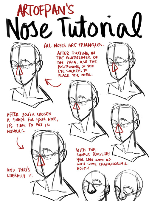


Whoo, super long nose tutorial! I’m sure there’s heaps I didn’t mention in this but this is generally how I approach it - the main thing is to check out references and try and draw different noses, it’ll help you create more diverse characters and have fun with it without being afraid of drawing the nose (since it’s genuinely one of my favourite things to draw).
Other tutorials: X


So I got a lot of messages after my first post asking me to explain layers, so I have put together a cheat sheet of the different layer types. The quickest way to become awesome with layers is to know exactly what each one does. Once again, I’m no expert, and these are just my personal definitions, so please try these out for yourself! LONG POST BELOWWW THE LAYERS CHEAT SHEET PART ONE: 1. NORMAL: Aw yeah you know all about this layer its just your average layer 2 DISSOLVE: This mode “dissolves” some pixels, allowing the lower layer to show through. very pixel-y. Reducing opacity makes it dissolve more. ________ 3. DARKEN: Now the difference between darken and multiply are a little confusing, so I will explain them together. MULTIPLY is more of a glaze, while DARKEN favors the darks on all layers. So if you have a darken layer on, it tend to reduce/remove the lighter tones on the layer if there are darker tones below it, while darkening the darks. 4. MULTIPLY: A glaze that darkens the color of the layer below. It is great for shading. Reduces whites. 5. COLOR BURN: “Burns” the lower layer favoring a more saturated look. Marks made over white are not preserved. 6. LINEAR BURN: “Burns” the lower layer, with a little less saturation than color Burn. Also will preserve colors over white. 7. DARKER COLOR: I tend to avoid this puppy cause it does not darken on the RGB channel. (feel free to try him though!) ______ 8. LIGHTEN: Lightens the colors below. Favors lighter colors on lower layers. 9. SCREEN: Lightens the colors below, but much closer to the “glaze” analogy as above. Reduces blacks. 10. COLOR DODGE: Often used for magic-y effects, color dodge bumps up saturation and is very bright. 11. LINEAR DODGE: Much like color dodge, but less saturation. 12. LIGHTER COLOR: Once again, this is an outside RGB channel layer, so I don’t really use this. As you probably have noticed, the second two groups are opposites, so if you have a good handle on one, you probably know exactly what the second group does! I will do the remaining groups next week as they do not follow this pattern. Thanks! drawmaevedraw.tumblr.com EDIT: Part two here: Photoshop Layers Part Two!!

Finally I got around to this. =ヮ=
Since there are so many different possibilities, this one was hard to make.
It’s hard to want to show a little bit of everything, but keep the sheet small as well orz.
Sorry there is only one shaded example lol (shading folds is a different story I think)
Hey! I love your art style and was wondering if you had any tips for drawing braids? Any techniques you found useful?
Hello! And thank you very much!
There may be easier ways of building braids than what I do, but this is just my process for drawing them, so take it with a grain of salt.
I’ll start with a line for whatever direction I want the braid to go in, if I don’t do a line and I have any kind of motion to the hair, boy do I mess it up lol

Next I’ll do wide half triangles, the line being my center, the right side or the left side always dropped lower than the other. If both sides meet in the center at the same level it’s not going to look very braid-like or have the illusion of being tangled with itself.

Afterwards you can remove the middle line if you want to take it further and connect each one with an alternating pattern like this one, giving it more of a braided look in the center.

Once the center is solid, you can add all the details you want in any style you like, curving inwards towards the center. I tend to like the more stained glass-ish appearance for hair so I’ll do very choppy, squared off lines to detail.


This works for whatever position you want to put the braid into using the wide triangles to build it up. It works for tightly woven or loose and messy braids depending on how wide/long you make the original half triangles.


I hope this helps!


Step-by-step by Joana Neves
Due to popular demand, I am sharing a step-by-step on how I render faces (though in this case I rendered a whole bust, with a focus on the face). I don’t believe this qualifies as a tutorial, but hopefully it will allow you to roughly understand how I draw and render things, and maybe help you a little bit. Remember that everyone has a different way to work, and what works for me may not work for you and that’s exactly why I wouldn’t call this a tutorial.
I am thinking of doing a similar one for faces with makeup, but I can’t tell exactly when. Anyway, if anyone is interested in that, I will be glad to know! Share your thoughts with me.
I hope you like this and as usual, thank you for the support!
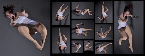
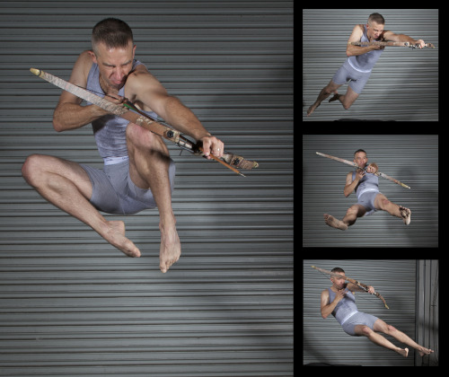
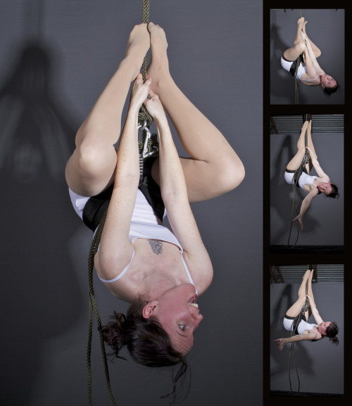
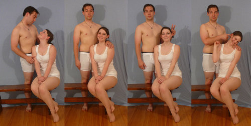
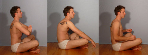
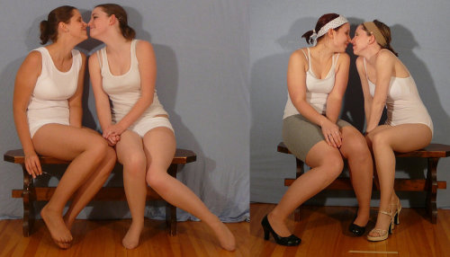
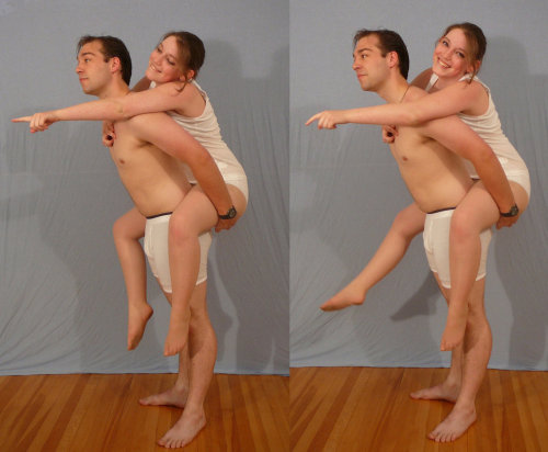
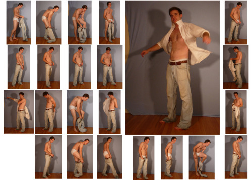
SenshiStock’s gallery consists of millions of pictures that are free to use as reference.
General Drawing Poses Sit and Kneel Dramatic and Reaching Drawing Poses Magic and Hogwarts Drawing Poses Staff Weapon Pose Reference Hammer, Axe and Bat Pose Reference Sword Weapon Drawing Reference Small Bladed Weapon Pose Reference Gun Weapon Pose Reference Bow and Arrow Archery Stock Foreshortening and Perspective Poses Dynamic Flying Falling Action Poses Deafeated or Laying Drawing Poses Magic Crystal Magical Girl Wand Weapon Transformations and Dance Cards Back Pose Reference Pin Up Inspired Poses for Drawing Performances Poses Life in General Poses Fights and Fighting Pose Reference Leaning Poses Classic Sailor Senshi Poses Wings Sailor Moon Villains Pairs Romance or Couples Pose Reference All the Male Stock Hanging Stock Drawing Reference Three or More Groups Instruments Mirrors Whip Technobabble


apparently ppl don’t know about waifu2x??? despite its… concerning name it’s literally the most convenient website i’ve ever come across as an artist
it allows you to resize artwork without it becoming pixellated. this is a MASSIVE help if you, for example, make lineart too small or something. it works best with things that 1. have no textures 2. have smooth lines 3. have cel shading, but it still works really damn well for things that don’t fit that profile
here’s an example:

normal size

2x in paint

2x in waifu2x
so like, there’s that. go wild
-
 kamitoraru liked this · 2 weeks ago
 -
 yukow reblogged this · 2 weeks ago
 -
 darcyshire liked this · 2 weeks ago
 -
 shiisiln reblogged this · 2 weeks ago
 -
 ralavyku liked this · 3 weeks ago
 -
 jellyingmwen reblogged this · 3 weeks ago
 -
 jastervhett liked this · 4 weeks ago
 -
 jessicathehedgehog123 liked this · 4 weeks ago
 -
 juanchoandpaddy liked this · 1 month ago
 -
 coloursdancebeneaththewaves reblogged this · 1 month ago
 -
 alokiasaltwater liked this · 1 month ago
 -
 clown-egg-and-other-things reblogged this · 1 month ago
 -
 emeraldthelynx liked this · 1 month ago
 -
 manonnnnsblog reblogged this · 1 month ago
 -
manonnnnsblog liked this · 1 month ago
-
 cool-username-was-taken liked this · 1 month ago
 -
 nalgetss reblogged this · 1 month ago
 -
nalgetss liked this · 1 month ago
-
 noxernia reblogged this · 1 month ago
 -
 psybelle-draws liked this · 1 month ago
 -
 sevenseaways liked this · 1 month ago
 -
 goblincat03 liked this · 1 month ago
 -
 filmhead-productions liked this · 1 month ago
 -
 pempempemto liked this · 1 month ago
 -
 pingrape liked this · 1 month ago
 -
 crow-thing liked this · 1 month ago
 -
 kasariansrefs reblogged this · 1 month ago
 -
 carouselingcircus liked this · 1 month ago
 -
 lunimistar liked this · 1 month ago
 -
 chatnia-starlight reblogged this · 1 month ago
 -
chatnia-starlight liked this · 1 month ago
-
 nacho-calamity liked this · 1 month ago
 -
 blueberryismilk18 liked this · 1 month ago
 -
 yurikor1 liked this · 1 month ago
 -
 paritnuft reblogged this · 1 month ago
 -
paritnuft liked this · 1 month ago
-
 troubleteenstuff liked this · 1 month ago
 -
 marusumi reblogged this · 1 month ago
 -
 trigonometricrats reblogged this · 1 month ago
 -
 mothinthestars liked this · 1 month ago
 -
 sulsulalee liked this · 1 month ago
 -
 elijah-terry liked this · 1 month ago
 -
 kirbysreturntodreamlanddx reblogged this · 1 month ago
 -
 themostinfectedpussy reblogged this · 1 month ago
 -
 cafte28 liked this · 1 month ago
 -
 scaehime reblogged this · 2 months ago
 -
 bonuscatart reblogged this · 2 months ago
 -
 captain-starskull reblogged this · 2 months ago
