Why Did No One Warn Me That No. 6 Would Hurt Me So Badly
why did no one warn me that no. 6 would hurt me so badly
More Posts from Badfungi and Others

making shitposts for a 25 year old show >>>>>

This has always stuck in my brain because it's the first time we see Vash talk about a plant as a person, referring to the plant as a girl instead of "it" like the crew and assigning morality/emotions to her... and it's so interesting me that he's shittalking her as selfish. Whenever Knives talks about plants, he's seeing them as weak and defenseless and unable to protect themselves from humans; a lot of other talk/imagery around the plants in the manga centers on them as angelic, giving, kind. Vash is the only one who ever talks about them expressing things like fear, confusion, anger, and selfishness, which feels a lot more like recognizing personhood in them than reducing them to victims or angels.
IDK I think it ties into my general frustration when Vash gets flattened to being only ever nice, patient, or worst of all, naive. As if he's kind because he can't help it or doesn't know better, not on purpose. He's frustrated with his "sister"'s behaviour and how many lives it's threatening, and he also sees her as a person whose life an personhood are equal to theirs and wants them all to be okay. He sees the negative aspects of others, is fully aware of the consequences of his actions and the risks, and he cares despite, even so, regardless.
(Also seen in another light it's just funny. Like ugh I just wanted to enjoy my trip and then my bratty sister threw a tantrum and nearly blew us all up just because a JJBA villain attacked)

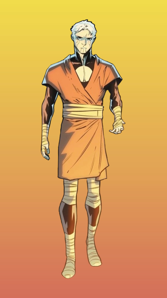
chains are still chains, no matter how comfortable

Razer in Green Lantern (2023) #6


WHAT!!!!
would you consider dropping some tips on how you color? your art always has such a nice feeling to it
Thank you so much, and yes, absolutely!
So... I have been agonizing over how to answer this question for over a week because I tend to make a lot of my major decisions based on what looks and feels good to me in the moment. It’s sort of hard to explain. Then I started getting philosophical with it (“how does one color? How do I explain aesthetic?”), and I started rambling, and had to cut the answer way, way, way down lol.
But here’s what I can help with right now. I think the most important part of how I color is my tools and what they allow me to do. These are currently my favorite brushes to use:

From top to bottom, I use Kyle T’s Gouache for just about everything. A lot of my recent pieces are done entirely in that– I love the chunky texture and how the pressure mimics traditional gouache. It’s great for children’s book illustrations, and filling linework, and realistic portraits. She is my soft wife and I love her.
I practically never use the default hard round. Ignore that.
The roller brush is another one I use for painting. It was my go-to before KT’s gouache, so you’ll find it a lot in my older work (and as a big texture thing in my current works). The “Sampled Tip” below that one I usually use for children’s book styled illustrations. It’s like a really dense, waxy crayon, so it’s fun for textured lines and details.
I always paint in my own shadows and highlights, but I like to use the soft round if I want to blow the shadow or highlight out. It’s for extra large areas.
And finally my pencil. I use it for sketching as well as linework, if I plan on doing a linework-centric piece. I don’t think there’s much of a difference between the two there… one is probably smoother than the other.
______________
The reason why I like textured, pressure-sensitive brushes so much is because they’re important to how I paint. When I blend, I don’t use a blender brush or a smudge tool. What I do is layer two colors– lightly– then use the eyedropper to select the color between them and continue painting with it. That’s probably the key to most of my work. I’ve gotten pretty fast at it, so I’m constantly selecting colors from the painting and reusing it throughout my painting.
I still use the color-wheel to hand-pick what I think will look best, though. This is probably going to be a really frustrating answer, but I choose color palettes based on basic color/lighting theory combined with personal aesthetic preference. It can take some studying (of both theory and other artists’ work). If you’re ever looking for a really great reference on the former subjects, I highly recommend Color and Light by James Gurny. Even if you’re not into watercolor or dinosaurs or realism, the guy is a master at explaining all that different stuff in depth.
Shape and negative space are also pretty important to me, but that's a whole other thing. And as a side-note, I recommend following more children’s book illustrators. Their work may look simple, but a lot of intention goes into how they use color, shape, space, and texture.
Also, on texture, I hand-draw most of mine. I love to add little scratches and drops and splashes when the painting is almost over. It's one of my favorite things to do :')
____
Now, the other most important tip:
Once I’m happy with the sketch/linework, and once I’ve laid down the basic colors of my piece, I do a Really Terrible Thing. I become a graphic designer’s worst nightmare and collapse everything onto one layer.
Then I paint directly on top of it, linework and all.
I do this for a lot of reasons, but mostly because 1) my tiny brain is overwhelmed by the clutter of too many layers, and 2) it forces me to approach a piece as if it was traditional media– a process which I find a lot more comfortable and rewarding. I paint right on top of the base colors, and right on top of the linework, effectively redoing and cleaning up what I already have there. Even if I'm working with a blank background, I'll paint a new blank one on top because it gives the feeling of a more unified piece, if that makes sense.
Basically, I approach my drawings as if I’m using traditional media. I like chunky brushes, utilizing (what I personally think are) interesting color combinations and textures, and smashing everything down onto one page so I can just paint.
Anyway, please let me know if there’s anything specific you’d like me to go into detail on, any pieces of mine you’d like to know how exactly I went about it, etc etc etc. I’m happy to answer ^^
when the fanoncel says something so canonphobic you have to hit them with the "reread the source material" stare
Psychopomp Merch is Now Available!

Check it out at FadingClubStore.com!
We've got all sorts of cool stuff for you! Clamber deep into the filthy catacombs to get these cool powerful objects!!
Check it out!!
(Please note: Because of current pricing situations, this first limited run will only be shipping domestically. I apologize for the inconvenience, and hope to be able to ship internationally with future runs.)


some Saigenos related drawings
-
 slbac liked this · 3 years ago
 -
 dee-zbignuts reblogged this · 3 years ago
 -
 ventiladornaranja liked this · 3 years ago
 -
 argonraptor liked this · 3 years ago
 -
 midnights-and-noons liked this · 3 years ago
 -
 3-enbies-in-a-trenchcoat liked this · 3 years ago
 -
 lalalalicia liked this · 3 years ago
 -
 tintins-hairfloof liked this · 3 years ago
 -
 stxrbxrry liked this · 3 years ago
 -
 schnezvy liked this · 3 years ago
 -
 wh0re-house liked this · 3 years ago
 -
 onehappyhungrydarkdragon liked this · 3 years ago
 -
 karirak liked this · 3 years ago
 -
 wheredoalltheducksgo liked this · 3 years ago
 -
 wishitwereus liked this · 3 years ago
 -
 never2remember liked this · 3 years ago
 -
 danimals00 liked this · 3 years ago
 -
 mushroommushyboi liked this · 3 years ago
 -
 aliflower88 liked this · 3 years ago
 -
 nozueluvr liked this · 3 years ago
 -
 gabsisnotamazing reblogged this · 3 years ago
 -
 no-disco-just-panic liked this · 3 years ago
 -
 iaquob liked this · 3 years ago
 -
 kohs liked this · 3 years ago
 -
 cloudless-salvation liked this · 3 years ago
 -
 icarusdiesatdawn reblogged this · 3 years ago
 -
 v-o-n-voyage reblogged this · 3 years ago
 -
 lanhours liked this · 3 years ago
 -
 vicisintoomanyfandoms liked this · 3 years ago
 -
 tisthedamnseasonfr liked this · 3 years ago
 -
 deborah-the-downer liked this · 4 years ago
 -
 badfungi reblogged this · 4 years ago
 -
badfungi liked this · 4 years ago
-
 violetti-spaghetti liked this · 4 years ago
 -
 link-the-feral-anon reblogged this · 4 years ago
 -
 songbirdpyka liked this · 4 years ago
 -
 steffybear liked this · 4 years ago
 -
 mouseymozza liked this · 4 years ago
 -
 the-awkward-orca liked this · 4 years ago
 -
 i-like-his-charm liked this · 4 years ago
 -
 dionysian-mystery liked this · 4 years ago
 -
 yoru-yo liked this · 4 years ago
 -
 todotouyaa liked this · 4 years ago
 -
 prettylittleghostboy liked this · 4 years ago
 -
 serenastrashheap liked this · 4 years ago
 -
 glitterynebulas liked this · 4 years ago
 -
 cats-are-anarchists liked this · 4 years ago
 -
 chthonickore liked this · 4 years ago
 -
 keith--akira--kogane liked this · 4 years ago
