Client Sketch Vs. Final Illustration


Client sketch vs. final illustration
When someone commissions me, I absolutely love getting a rough sketch/doodle of their concept—it makes the first steps of an illustration (composition/posing) so much easier.
I'll never ever judge a client for a messy sketch!! (And also, no pressure to send something like this if you'd like the artist to take the creative reins on your piece.)
More Posts from Curruidcoinhenn and Others
going through utena with my friend has been a riot and a half and it's just so great that i can't wait for more!! i can but still.
Pose ref by @adorkastock.

My OC, Akabane Yue, before the incident.
What ARE Vanishing Points?
So I feel like a lot of confusion with drawing in perspective is because people are not taught the absolute basics properly? So let’s do that.
Let’s say we have a cube.
Now, a cube we know is made out of 6 squares or rectangles, and every edge is at a 90 degree angle.
so every opposite edge of a cube is exactly parallel, right?
but let’s say we draw a cube using only parallel lines:

this looks a little weird, you know? Like if i try think of this as an object in 3d space and i look at it for too long, the faces start to look really warped - with like the back looking bigger than the front as if its been made out of weird wonky trapeziums

so what’s going on here? if all those edges are exactly parallel, why does it look weird?
lets take a look at this photo of a railway track

Now we know that the rails on a track are always going to be parallel, they have to be the same distance apart so the train can stay on the track yeah?
But we can very clearly see that these tracks are converging to a single point in the photo.
So what does this tell us, exactly? That our view of the world is naturally warped, and that lines that are physically parallel when drawn in perspective will converge to a single point.
Now, I could call this image “one point perspective” - but that’s not really true,

if these lines are also parallel, then they must also converge to a single point in perspective, right? so lets add another point

clip studio paint automatically adjusts the horizon line to fit the new points you add to your perspective…. notice how the horizon line actually fits the photo better now?

our new point is a very very long way away, so we don’t notice a lot of difference in the angle between lines, but the point that i’m trying to make here is:
Drawing with perspective guides is not about choosing one, two, three point perspective etc. those are just quick ways to set up a certain viewing angle
What you are doing when you use these guides is making your parallel lines converge to a point.
So, if you want to draw a big ol’ cube that’s aligned to be parallel with these railroad tracks, then you can do that with the same point as the tracks - because it’s parallel. It’s on the same axis!

but what if you want to draw a cube that’s rotated, and isn’t parallel to the tracks?
well that’s not too difficult to do if you know that every point represents one set of parallel lines.
If these lines aren’t parallel to the ones you already have, then clearly you just need new points.
We’re not planning to tilt this cube up into the air, or rotate it onto its side, so we’re going to leave the vertical axis alone, and just move our horizontal points to a different place on the horizon line

But speaking of the vertical axis - the only points that will be on your horizon line are the ones that are flat on the ground. But you can still have points that are not on the horizon line!

This is important to remember because if you’re trying to draw something like a slope or stairs, something that has an incline, it’s not going to be level with your horizon.
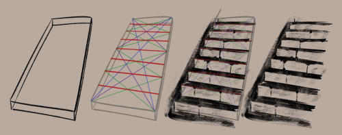
Let’s draw some stairs as an example.

This is actually pretty simple - first draw where your slope starts and ends by drawing a big L shape.
this will give you some parallel corners, which you can then connect to make a new point for your slope

And with this you can then find the centre and divide that up into equal parts to make your stairs (http://lesbianlinkle.tumblr.com/post/176704472820)


So lets go back to our original cube, with the knowledge that our parallel lines should all converge to a point and draw it again

well, doesn’t that look better!
but also, now you know how to make a cube lean against its buddy like this

because we just make new points for the new parallel lines

Anyway I hope that clears some things up, and makes perspective easier to understand!
Also if these tutorials have been helpful and you’d like to support me, I do have a patreon & a ko-fi you can donate to :^)
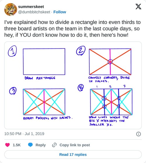
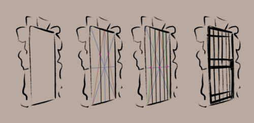
really helpful technique ^ once you know how to divide by halves and thirds it makes drawing evenly spaced things in perspective waaay easier:
does anyone wanna hold hands until we feel a little braver
tweet
Something like this would be so colossally helpful. I'm sick and tired of trying to research specific clothing from any given culture and being met with either racist stereotypical costumes worn by yt people or ai generated garbage nonsense, and trying to be hyper specific with searches yields fuck all. Like I generally just cannot trust the legitimacy of most search results at this point. It's extremely frustrating. If there are good resources for this then they're buried deep under all the other bullshit, and idk where to start looking.


here's a landscape tutorial!
i focused on natural environments for this one, if you find it helpful I'll be back with how I learned to draw buildings.
let me know if it helps! and have fun drawing ✨
My Mom needs help
Hi.
This is gonna come across as a scam since I don't use this blog right now and- honestly? I don't blame you for thinking that. I put it down in a document, but I'll write it out here too.
On April 26th, I got a message from my mom saying she needed to talk to me. I figured there'd been something new like maybe my cousin was once again in some sort of financial trouble that they wanted me to fish her out of and give to "the love of her life" (which is probably where the money I got my cousin before went).
What I didn't expect was that my mom would ask me for help to get her out of her situation. She started crying on the phone during because it was that horrendous. Telling me about how she doesn't get basic amenities, is treated like the scum of the earth and her dog is getting thin and she doesn't want to die. Doesn't want her dog to die.
And honestly? I do not want to lose my mom nine months after my brother's passing. I don't want her to lose the dog she's cared for since he was a pup that she bonded with over their shared status as the small one of the family.
The worst part about this? My mom is disabled and on SSI/SSDI, so she's on a horrendously limited income because it's not been fixed for inflation and prices rising/modern day needs.
Here's the google doc that has the full information. I got evidence today (April 30th) of the conditions she has to live in and it's bad. She looks like she's living in a repurposed shed, has no AC in Arizona of all places and is basically being treated less than a prisoner.
You can donate to help her here: https://ko-fi.com/tsukuyomibun
All the money will be given to her the moment she says to give it to her. I want her out. I want her safe and with her cousin/sister instead of slowly dying in the heat of Arizona.
Hey seiishin, I'm a beginner artist and i was hoping you could give a full tutorial on how you color?
hello! this is a bit of a hard question to answer since i dont think giving a tutorial of how i colour without learning any foundational colour concepts first would be very beneficial, so i'll try to give you some basic tips on picking colours instead since this is a very VERY expansive topic and im simply not the kind of person that can pass on that knowledge very well especially since im not the best at it lol
when im picking colours for my drawings, i try my best to "unify" the colour pallet so that it seems more cohesive, this tip from ggdg sums it up pretty well i think

other than that, i usually try to pick colours that generally look good together based on different colour harmony concepts, like these!

i'll try and show you an example with something i'm working on right now. you'll notice i didn't colour pick tinkaton's colours from its art and went for a warmer pink and saturated the blues of the hammer a little.

you'll also notice the canvases i draw on are NEVER pure white. this isnt to say pure white is something that can never be used but white is a colour that usually influenced by surrounding colours, so pure white in most pallets just wont look right. so its not usually a colour i would use as a backdrop if youre trying to pick good colours for your art. but again, there's always exceptions and this isnt a hard rule. here's pure white compared to the colour my canvases usually start with

another thing i should touch on briefly is colour relativity and the importance of value and saturation.
value is SUPER SUPER important for making sure all the colours in your art stand out from each other and read clearly. as you can see here, most of the values here stand apart from each other, and i can see that i probably need to adjust the darkness of the light blue in comparison to the pink hair tips, though the lineart separates them well enough already i think. this is also a good way tocheck you havent made any dark skinned characters too light. values are important guys!
hot tip: put a layer of pure black on top of your art and set that layer to "colour" and BOOM! you can see the values of your art in grayscale.

and i'll also briefly touch on colour relativity. because we percieve colours relative to each other, we usually read a colour as something its not when its surrounded by certain other colours. let's take a look at my background drawings in the cover i did for the shuichi saihara zine:

though i only used a bunch of different purples, when all of them are perceived in relation to each other, a warmer purple can look like blonde hair amongst all the other purples!
as for the brushes i use while colouring, i like textured brushes! i bought these so i cant share them for free but im sure there are many free alternatives out there

anyway, sorry if this isnt exactly what you wanted, but there are TONS of people out there that have worded this better than i ever could, i would suggest looking up some youtube vids on colour theory, but i hope these little tips are useful enough!

Reblog this to ease the back pain of the person you reblogged it from
-
 space-cowboy2227 liked this · 2 weeks ago
 -
 1-lamentis reblogged this · 2 weeks ago
 -
 hey-gaymers liked this · 3 weeks ago
 -
 skcirthinq liked this · 3 weeks ago
 -
 bunsenbanner-archive liked this · 3 weeks ago
 -
 bearlywrites liked this · 3 weeks ago
 -
 swarthysinner reblogged this · 3 weeks ago
 -
 unicornbeck liked this · 1 month ago
 -
 ragerqueen liked this · 1 month ago
 -
 jonksi liked this · 1 month ago
 -
 mazyandbubbles liked this · 1 month ago
 -
 sunflowers-and-scales liked this · 1 month ago
 -
 kayyqua liked this · 1 month ago
 -
 valuedartist22 liked this · 1 month ago
 -
 thecrystallabyrinth liked this · 1 month ago
 -
 people-you-should-commission reblogged this · 1 month ago
 -
 kevin-the-sea-cucumberbatch liked this · 1 month ago
 -
 zhekiel liked this · 1 month ago
 -
 goblinthatdraws liked this · 1 month ago
 -
 skysonata liked this · 1 month ago
 -
 summerlimeismethebrony liked this · 1 month ago
 -
 thequantumranger01 reblogged this · 1 month ago
 -
thequantumranger01 liked this · 1 month ago
-
 terrestrialtraveller reblogged this · 1 month ago
 -
 vannistilldraws reblogged this · 1 month ago
 -
 therabbitthatpostthings liked this · 1 month ago
 -
 scouring-the-depths liked this · 1 month ago
 -
 eliasdrid liked this · 1 month ago
 -
 argentoau reblogged this · 1 month ago
 -
 issilya liked this · 1 month ago
 -
 make-it-80s liked this · 1 month ago
 -
 moodside-swing reblogged this · 2 months ago
 -
 mj-dev liked this · 2 months ago
 -
 tenbirdsinatrenchcoat liked this · 2 months ago
 -
 loudn0isesart liked this · 2 months ago
 -
 aaaaawolfquarters liked this · 2 months ago
 -
 cerise1loves2art liked this · 2 months ago
 -
 typopandas reblogged this · 2 months ago
 -
typopandas liked this · 2 months ago
-
 winteriine reblogged this · 2 months ago
 -
 fenrislover liked this · 2 months ago
 -
 aiwendilism liked this · 2 months ago
 -
 yummyquake liked this · 2 months ago
 -
 evana-47 reblogged this · 2 months ago
 -
evana-47 liked this · 2 months ago
-
 diemortals liked this · 2 months ago
 -
 dreamsaboutdreams liked this · 2 months ago
 -
 craiglovesebichu liked this · 2 months ago

I just post whatever I want, usually. Mostly rambles or reblogs.Artwork TagHeader taken from this video
130 posts