Cute
Cute


More Posts from Genna-ivanovich and Others
MUAH
yuri gagarin is such a sweetheart 1 like = 1 hug for yuri gagarin 1 reblog = 1 kiss

International rendezvous in space. The Soviet Soyuz 19 spacecraft approaches the Apollo Command Service Module for docking during the Apollo Soyuz Test Project, July 1975. The historic mission was the 1st joint American/Russian space flight & symbolic of the end of the space race which kicked off with Sputnik back in 1957. The Docking Mechanism of the CSM is visible at the top of the photo. Soyuz 19 spent 5 days & 22 hours in space completing 96 orbits while the Apollo spacecraft orbited 148 times over 9 days.

By the time Americans arrived on Mir—nearly a decade into its life—the station had become cluttered with used-up and broken equipment and floating bags of trash. During Mir’s lifetime, no adequate remedy was ever developed to deal with the stowage situation. Mir looked like a metal rabbit warren, or, as Mike Foale put it, “a bit like a frat house, but more organized and better looked after.”
hey! im not that well versed on all things space bc it's a relatively new interest of mine. how come ive seen so many blogs post about not wanting the other nasa logo? you totally don't have to answer, i just saw that you reblogged a post about it :) hope you have a good day!
By the other NASA logo do you mean the worm or the wormball?
And to answer your question, I’m think the logo arguments are pretty much entirely aesthetic. Some people think the worm is dated and ugly, other people love how sleek it looks. Some people think the wormball is a good compromise, others think the aesthetics are clashy (I’m in that boat.)
For reference, here’s some NASA logos. The ones under the cut are a little rare and honestly you don’t have to care about them, they just look cool.

This is the meatball. It’s the original from the 60′s and it’s still in use today. Detailed yet clean. Gorgeous. The swoosh is a tie in with the aero side of NASA and the stars and orbit with space. The serif lettering manages to look classy rather than dated. Even if this isn’t your preferred logo, you have to respect how it’s got the perfect amount of detail to look interesting while also being ca clean design.
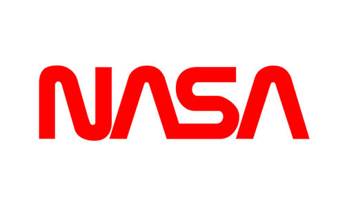
This is the worm. It was an attempt to modernize the logo around the start of the Shuttle/Skylab era. If this was for any other agency, I admit the worm styling would be a little dated. But personally, I think this logo brings back some of the enthusiasm of the early Shuttle era, just like the meatball brings back the energy of the Apollo era. It’s striking, it’s recognizable, and it’s one of my favorite worm stylings. (Compare it to SF MUNI’s worm logo, which was so cluttered I, as a local, didn’t notice it said “muni” until I was a teenager.)

This is the wormball. (Wikimedia was giving me trouble so it’s just a transparent background; I actually don’t have this one saved on my laptop for personal aesthetic reasons lmao.) Some people love it, but you will never convince me to. 100% personal preference, though, so if you love it, that’s fine, just keep it away from me. It’s like pineapple on pizza; you either love it or you hate it, but you’ve definitely got a strong enough opinion to argue about it.

This is NASA’s seal. You’ll only ever see it on official documents and things like that. It’s not something that’s displayed very commonly on, say, the wall of a NASA facility, and even less commonly on spacecraft. I believe this has been in use since the creation of the agency.
And, last but not least, I’d like to leave you with how the insignia is displayed on NASA aircraft, because they all. Look. Sick.

When they display the meatball on the rudder of an aircraft, like on SOFIA here, they omit the meatball and stars and display it like this! It looks cool as hell and it looks even better on aircraft where the rudder frames it nicer. (While I was searching around I saw a mockup for a meatballess wormball and it didn’t look awful.) Maybe we should call this the vegan meatball?
It’s also displayed like this on aircraft that were associated with NASA/USAF’s hypersonic research program in the early 60′s. Some pilots from this program went on to become astronauts.

... Including Neil armstrong who flew the X-15 above.
Aircraft from that program also featured a pretty neat rudder: it has this yellow stripe with NASA in a serif font that's unique to this design, as far as I know.
The first photo is Neil's X-15 again, the other is Dick Scobee's X-24B.


Lastly, the worm was plastered unedited onto aircraft during the worm era. It didn't always look good, but it looked too sexy on the X-29 to not include a pic.

(All photos are mine from NMUSAF!)
ah, thank you so much to mention me on this @la-francaise-de-coeur. makes my day :,,,)


Musa Manarov is a Azerbaijani cosmonaut who has spent 541 days in space.
russian flower vocab 🌻
aster - áстра
carnation - гвозди́ка
cherry-tree - ви́шня
chrysanthemum - хризантéма
cornflower - василёк
dandelion - одувáнчик
dahlia - георги́н
daisy - ромáшка
daffodil - нарци́сс
forget-me-not - незабýдка
geranium - герáнь
hyacinth - гиаци́нт
honeysuckle - жи́молость
iris - и́рис
lavender - лавáнда
lilac - сирéнь
lily - ли́лия
lily-of-the-valley - лáндыш
orchid - орхидéя
pansies - аню́тины глáзки
peony - пиóн
poppy - мак
rose - рóза
rosebud - бутóн рóзы
sunflower - подсóлнечник
tulip - тюльпáн
violet - фиáлка
flower - цветóк
flower bouquet - букéт цветóв
petal - лепестóк
meadow - луг
pot flower - кóмнатный цветóк
to plant - сажáть
to blossom - цвести́
ah, that would be sweet~~!! everyone can visit the space station and like....they can meet a cosmonaut/astronaut who visiting the space station too!!💞👍 <3<3
I honestly cannot wait to work for the next 10/15 years and then just drop everything and move to a nice area with loads of land where I can get a job helping other people and every night I come home to my goats/cows/dogs/cats and I can hang around barefoot on my front porch and care for all my plants


Alexander Gerst (ESA), Serena Auñón-Chancellor (NASA), and Sergey Prokopyev (RSA) board the International Space Station at 9:01 a.m. EDT to join Expedition 56 and greet their crew members on the ISS, June 8, 2018.
i would die for this pic.

Sergei Krikalyov
Davide Monteleone

Yuri Gagarin in Kazan. Photo by Vladimir Zotov (1967)
-
 suki-nami liked this · 3 years ago
 -
 zaboomanyoom liked this · 5 years ago
 -
 artblockedgremlin liked this · 5 years ago
 -
 cyberpsychicroadstudent-blog liked this · 5 years ago
 -
 katjakun liked this · 5 years ago
 -
 genna-ivanovich reblogged this · 6 years ago
 -
genna-ivanovich liked this · 6 years ago
-
 thesublimeiseverywhere liked this · 6 years ago
 -
 mshtea-blog liked this · 6 years ago
 -
 fire3837766-blog liked this · 7 years ago
 -
 nolongerhomo liked this · 7 years ago
 -
 walfels-blog liked this · 7 years ago
 -
 mottemotte liked this · 8 years ago
 -
 xxseborgalovexx-blog liked this · 9 years ago
 -
 fourtrisdivergames liked this · 10 years ago
 -
 jinjinjara-loves-yoongichi reblogged this · 11 years ago
 -
 jazzy-jessica liked this · 11 years ago
 -
 blooddiamond24678 reblogged this · 12 years ago
 -
 player2femmefrance-blog liked this · 12 years ago
 -
 midnightartist15 reblogged this · 12 years ago
 -
 pozdrawiam reblogged this · 12 years ago
 -
 3chocolatechipcookiesplease liked this · 12 years ago
 -
cyelle-art liked this · 12 years ago
-
 claridwen reblogged this · 12 years ago
 -
 peach-m00n-blog liked this · 12 years ago
 -
peach-m00n-blog reblogged this · 12 years ago
-
 erarousfire liked this · 12 years ago
 -
erarousfire reblogged this · 12 years ago
-
 datonederpypony liked this · 12 years ago
 -
 usagi323 reblogged this · 12 years ago
 -
usagi323 liked this · 12 years ago
-
 kokorrosive liked this · 12 years ago
 -
 moved-to-lilredgabbs liked this · 12 years ago
 -
 otakuqueen9 reblogged this · 12 years ago
 -
 onepieceperson reblogged this · 12 years ago
 -
onepieceperson liked this · 12 years ago
-
 sadakasana liked this · 12 years ago
 -
 hetamangacaps reblogged this · 12 years ago

Pamir | 19 | eng/ind | mostly cosmonaut/genshin/language related
228 posts