Giving Amazing Presentations!
Giving Amazing Presentations!
These are my tips for giving really good presentations in class! It will be slightly more geared towards history, english, etc. and some of the tips might not apply to science classes, but hopefully this helps.!
Presenting Well:
Know what you are talking about. When you are giving a presentation, you should be an expert in what you are talking about. Study the topic like it’s your job.
If you are working with a partner, still make sure you know it all! When I do partner presentations, this is what I do. Decide who is going to do each part of the presentation. This is the part that you should know backwards and forwards. But! You should also have a good amount of knowledge about your partner’s topics. If one of you falters or forgets something, the other can back them up. Also, this helps to make you look more cohesive and less like you just split it in half.
Be able to answer questions. This ties into my last point. If a classmate or a teacher asks you a question and you have no idea, it doesn’t look good. You should know more information than just what you’re presenting.
Don’t read from notes. If you stand up and just read from a page, your class might as well be reading this information from a textbook. If you can, don’t use any notes at all. If you absolutely need them, make them super short jot notes, not full sentence pages of notes.
Organize your slides in a way that makes sense. Start with background information, then state your thesis, then get into your arguments and more detailed information. Don’t put your thesis at the end, or skip over the background information.
Include a conclusion at the end of your presentation. A presentation is basically a verbal essay, so you should be including all of these parts. Restate your thesis and quickly sum up the reasons that you talked about in the presentation. This will help everyone in your audience to understand what you discussed.
Dress up a bit and try to look really good. I personally believe that a lot of confidence can come from the outside. Looking good and being comfortable with what you’re wearing will make you more confident. Also, a lot of teachers want to see that you made an effort to look professional for a presentation.
Talk to the class like you’re having a conversation. Obviously, you don’t want to be too relaxed and seem like you don’t know what you’re talking about. But it is really helpful to use your normal language and tone, throw in a couple jokes, and just act normal! It’s always really weird when someone turns into a robot when they are giving a presentation, so try to avoid that if possible.
Practice in front of someone! This will help you avoid looking awkward and help you go at a normal speed. Also, they can tell you if there was a part that they didn’t understand or anything like that. Try to choose someone objective, that won’t lie to make you feel better.
Time out your presentation. You have to time out your presentations before you do them. It’s not fair to other presenters and to your class if you go way over the time limit. Time yourself reading through the presentation, then again when you present in front of someone. Maybe leave a bit of time at the end for questions, too.
Making Good Visuals:
Use something simple. Unless your teacher suggests otherwise, just use slides or something simple like slides. Unless you are really good with these kinds of programs, when you try and do something like a video or a Prezi, its way more likely that it will look unfinished or crazy. I personally hate Prezi, because it’s way too hard to follow.
Use a built in slides theme. Again, this might not apply to you if you’re really into graphic design, but for the most part, stick to this rule. When you try and mix your own colours and patterns and fonts, it can tend to look really busy. Try to stick with a preset theme.
Do not have full sentences. You should not have more than 10 words on your entire slide, if that. A really good photo, political cartoon, graph, or other graphic says way more than an exact copy of the words you’re already saying. Your slides are a visual to back you up, not the main focus. If your class has to take notes on your presentation, this might not apply.
Don’t use a white background. Pure white makes your eyes hurt. Change the background colour to a really pale grey, one shade lower than white. This will help your audience focus on the slides better.
Make sure your visuals are working. Ask your teacher if you can double check that your slides are compatible with their computer, or at least check it on a computer at your school. Especially if your school uses Mac and you use Windows (or vice versa). Also, check that your videos and audio work!
More Posts from Marathon-notasprint and Others
“I’ve been living alone so long, everything about me’s private. I’m surprised anyone’s able to understand a word I say.”
— Kurt Vonnegut, from Mother Night; “Werner Noth’s Beautiful Blue Vase,”
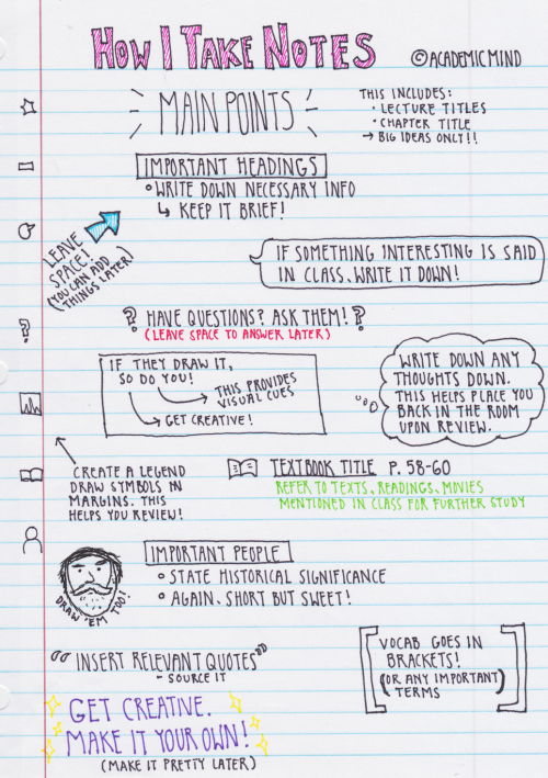
Some of you have requested that I show you my note taking technique. This is in no way a proven technique, but it really works for me and many of my professors have applauded my structure. So try it, and if you like it and it works for you, great! If not, I commend you on having a more structured system! These are my general rules when I take notes:
1. Leave space. A lot of space. While going through previous notes, whether it be right after class or a month later, I always found that I had information that I wanted to add, and cramped pages never allowed for that. Plus, it’s a bit less daunting on the eyes when there is some room between ideas. I do realize that this is not very eco-friendly, but hey!
2. Use the margins in a smart way. I have developed a “legend” of symbols to draw in the margins so that when I need a quick scan of what pages in the textbooks I referenced or vocab, I can find what I need easily. It might not seem useful on this one page, but when you have a whole 3″ binder full of notes, it’s a blessing.
3. Write on one side of the page. Again, not a eco-friendly option. However, I’m sure there are those of you (my past self included) who have wished you just had another page to write down book notes or additional thoughts without having to get a fresh paper. This solves that!
4. Make it pretty later. I know this page is visually appealing, but keep in mind that I was in my nice warm room by myself and listening to music while writing this. My notes straight out of class aren’t color coded and they definitely don’t have cute little decorations on them; just get the information down, worry about aesthetics later.
5. Put yourself in the classroom. You might think: “but I’m physically in the room what the hell are you talking about”. The concept is weird but it works. I always try everything I can to make sure I place as many visual cues in my notes as I can so that when I look back on them later I remember exactly where I was and what was happening. Are you not paying attention and thinking of food? Write it down. Did someone fart? Write it down. Placing yourself in the room is the most beneficial thing you can do for future you.
6. Keep it short. I can’t tell you how many times I freaked out when I first got to college because I was trying to write everything down. I was certain I was going to miss something. WELL HAVE I GOT NEWS FOR YOU. You aren’t going to miss anything if you keep your bullets to a minimum of one sentence. It’s proven that short phrases in your own words help memory better than full sentences that the professor gives you.
Finally, make it yours. This is a system that works for me because my brain is weird and can’t take notes the Cornell or outline way. The most important thing to learn in school is your own flow of things. Experiment, be creative! I hope I have helped those of you who aren’t traditional learners realize that there isn’t just one way to process information. If any of you have any questions or need specific examples, let me know! (I realize there is a typo on this but hey don’t worry about it) 🙈

Note taking masterpost:
An anon requested this today. I though I had already made one, but apparently not.
General note taking and guides:
Combining lecture and reading notes
Resources about making chapter outlines
Recognising key points in a lecture / reading (for efficient note taking)
10 tips for good note taking in lectures
Guide to note taking (the major approaches and techniques)
What to do after you take your notes
Organising a notebook
Taking notes that work (By Dustin Wax)
Top note taking tips
An example of me using cornell notes
Visual / Pretty Notes:
Visual guide to illustrating notes
How to make your notes prettier!
Pros and cons of pretty notes
Guide to colour coding
Guide to my graphic notes
How to make notes cute and neat
Inspiration: 1 / 2 / 3 / 4 /
Electronic Note taking:
Guide to taking typed notes
Handwriting versus typing your notes
Organising your typed notes
Note taking apps

This fake brain actually has the same consistency as the real deal. So now you know how concussions happen!
The Best Study Techniques:
I’ve recently come across a 2013 study which aimed to compare the efficiency of different study techniques.They evaluated whether the benefits of the techniques generalised across learning conditions, student characteristics, materials, and criterion tasks. Here is a summary of their results:
Least Effective Study Techniques:
Highlighting — including underlining textbooks and other materials
Rereading
Summarisation
Keyword mnemonics — the use of keywords and mnemonics to help remind students of course material
Imagery use for text learning — creating mental images to remind students of material
Moderately Effective Study Techniques
Elaborative interrogation — uses “why” questions to get students to make connections between new and old material.
Self-explanation — prompting students to provide their own explanations for problems while learning material
Interleaved practice — mixing different kinds of problems or material in one study session
Highly Effective Study Techniques
Practice testing — any form that allows students to test themselves, including using actual or virtual flashcards, doing problems or questions at the end of textbook chapters, or taking practice tests.
Distributed practice — studying material over a number of relatively short sessions.
(Source)
🌠Guide to Study Guides
Hi, so I make study guides when I revise as referenced to in this post/ask here. So in this post I’m gonna try and show you guys how I go about making a study guide like I did for sociology or philosophy, both of which are shown in that link there. This is my method so it probably is really complicated and stuff, I know for sure that my guides are overly “fancy” and whatnot, but it makes me happy and I guess the extra effort does pay off, at least aesthetically.

Okay, yes, let’s begin…
1. Visit colourlovers.com to choose a colour scheme for your guide!
I’ve provided the link to the most loved palette page which is where I choose my colour scheme. In Word, you change your colour scheme by choosing Page Layout > Colour > Create New Theme Colours and you go from there!! I basically started making my own colour schemes after I went through all the ones already provided by Word, but to be honest you can start with those since they’re really nice too. I recommend: Apex, Composite, Foundry, Metro, Module, Slipstream and Solstice.
If you do want to make your own colour scheme, you should get ready to do some fiddling around because I still don’t get this really. Making a colour scheme on Word requires at least 10 colours, that’s okay because on colourlovers, palettes are usually made up of 5 so just choose 2 that you think suit each other :) After this you need to input the hex codes manually into the popup window of “Create New Theme Colours” starting from Text/Background - Dark 2 to Accent 6. The hex codes are provided by individually clicking on the colours.

So that’s what one of my self-made colour schemes look like, you should be aware that Word usually randomises these? I don’t really know how it works but basically sometimes the colours won’t necessarily be in that order when you go to select it to specifically colour a word, if that’s the case you’ll just have to fiddle and change it around to choose your preferred colour in the scheme. Also not all the colours will go into the textbox options so be aware of that too!
2. Font shopping
Next if I haven’t updated the font collection for a while I’ll go to dafont.com because I just…really like jazzy fonts. From here I’ll either check out “All The New Fonts” (option is at the bottom of the front page) or go to the menu titled Script, and check out Handwritten, Fancy or Various. Here are some links to asks about fonts that I’ve used in my shown study guides or just fonts I like in general!! 1 and 2.
Okay so as you can see in the Disney Princess Document/Sociology Study Guide I used at least five fonts, I usually average around 4? Once downloaded choosing fonts that you like for your guide is basically a trial and error process, I choose any fonts that I like or haven’t recently used or just recently downloaded that I want to try out and I match them with what I think would look nice! Here I’ll show you why I use around four or more fonts:

In order to make the process of typing up your guide with these fonts easier, highlight one, so for example the Big Title, right click > Styles > Save Selection as New Quick Style…and it’ll be available to you in the Quick Styles menu underneath a heading like Style1. After this to easily change a font to that particular font, just highlight, go to Quick Styles, choose that particular font and bam! I try to make my fonts match, so if one is bold, I aim for at least a thick-ish font in the rest of my choices. Now to go through what they’re for.
So obviously the Big Title is for your BIG TITLE that could be your subject or your main topic, so if it was sociology (like in the first pic) I would use it for Key Concepts and Methods, I might later reuse the font for another BIG TOPIC, but really…it’s your choice.
The Subtitle is what I would use for well…your subtitle, so following my first pic it would be the subtitle of Positivism versus Interpretivism…Three Key Concepts, etc. The heading is therefore for the headings under the subtitle (this is only if you’re making a guide for something that is like intensely sectioned, like sociology), so I’d use that font for where it says Reliability etc.

It just brings something extra on top of all the later colour you’ll probably use, although I only use it for like a set theme, so dates, names etc. and only either a word or a phrase, if it gets too long it’ll just mess up the format of your sentence.
3. Okay, so you’re happily typing away but now you wanna add the speech bubbles, you wanna add the textboxes and the Disney princesses! Don’t worry my friend, I got you.
Basically I add textboxes or speech bubbles for 2 reasons, either to highlight a particular point or differentiate a piece of information from the rest OR to fill up space because of some particular study guide pet peeves.
Pet peeve, when a particular sentence ends like this:

I know it might seem like a bit much, but to be honest, it throws the whole format of a block of text if a bit of it ends with like this huge expanse of space. So in this instance I either will insert a photo or I’ll try and delete a word or add a word until I’m satisfied. THIS IS JUST ME, IF YOU DON’T CARE OBVIOUSLY IT DOESN’T MATTER 👌
You can insert speech bubbles by going to Insert > Shapes > Callouts (you’ll find it there) and textboxes by going to Insert > Textbox > Draw Textbox (I draw mine since I don’t tend to use the ones provided by Word. With the speech bubbles they actually act as textboxes, but I’ve found that using it in that way takes up a lot of space as in your words won’t necessarily take up the whole of the speech bubble so it simply expands and it’s all messy. Therefore, I put a textbox on the top of it, make the background and outline transparent and type there to save space.
Here are some examples of when I’ve used photos or speech bubbles to fill up space or solve the annoying sentence problem.


I generally tend to have themes around what photos I use, so for example my sociology guide was largely based on Disney/Cartoon Network depending on how I felt and I’d use particular photos to emphasise a point and make it more entertaining I guess… As you can see the speech bubbles with LSP are for filler purposes but also to differentiate information, it just adds something extra really. Also because I continuously indent my guides (since I type with bullet points) as they get further and further in they’ll leave gaps that can be filled with photos, seen here with what I’ve done with LSP. Also with the photos that I choose, I search for the ones with a grey, checkered background which means that they’ll be transparent, allowing me to put them in front of a textbox or just makes overall design easier, it means that I can have the Gangreen Gang in front of that textbox like that :)
4. Final step, going over your guide when it’s done.
I then go through the guide again and highlight, underline, italicise, bold, colour etc. particular points of a sentence/paragraph that I want to remember! I do this in order of the colour scheme that appears in the menu when you click to change the colour of a font, so I’ll highlight particular words for a portion of a paragraph before changing, achieving a sort of a rainbow effect, like so:

These are from my history study guide, where I made front covers (which I don’t usually do…I feel like all my guides really depend on how I feel and my subject). This is what they looked like if you wanted an idea for something you could do too!!

Um..so that’s pretty much it! I’ve tried to make this as extensive and as in-depth as I can, I’m sorry it ended up SO LONG, I’ve never made a post this long before so I’m really sorry. I would put it under a read more but I feel like the font on my blog is too tiny for when it’s redirected and I’d much rather not have everyone straining their eyes. If you guys have any more questions, please feel free to ask. If you want any more examples or screen shots of my guides, just hit up my ask box!! Sorry for this taking so long and being so long once again and I really hope it helps you all in at least some way!
***As an addition, those washi tapes you see are digital washi tapes which you can get just by googling! I use the free ones which only require a lil’ searching for. Also please tag me in whatever study guides you make and upload, I’d love to see them!!


yay, my first masterpost !! it’s all about playlists i love to listen to while i study !! i hope you get some use out of it !!
instrumental
focus and study
what do u mean u dont like classical?
focus.
sit down + revise
classing it up
classical.
the universe’s background score
gaming, movies, tv, and anime
DETERMINATION
video game ost
running
PAUSE:
puella magi
sinnoh, pt. 1
animal crossing new leaf
study your little heart out
empowering
bad grls do it well
the female mastermind
CAPRICORN
she’s a rebel
werkin girls
magical girls represent
eyeliner so sharp it’ll slit your throat
good vibes
a hopeful new year
indie love
i’m good, i’m good, i’m good
goodmorning!!!!
flour(s) in your hair
i wanna get better!!!!
the kids aren’t alright;
and that’s it !! thank you for reading and once again, i hope you get something from it !!


-
 sislearning liked this · 2 years ago
 -
 letscandyme liked this · 2 years ago
 -
 cinnamonecho reblogged this · 2 years ago
 -
 gettingwll reblogged this · 2 years ago
 -
 disappearanceofego liked this · 2 years ago
 -
 sofiap23 liked this · 3 years ago
 -
 moomin-moon liked this · 3 years ago
 -
 a-maze-h liked this · 3 years ago
 -
 monikabenkova liked this · 3 years ago
 -
 wzyworld reblogged this · 3 years ago
 -
 hopefulmelodys liked this · 4 years ago
 -
 gigiraffestudies liked this · 4 years ago
 -
 engrstudies reblogged this · 4 years ago
 -
 vaguelegend2112-blog liked this · 4 years ago
 -
 sumastudies reblogged this · 4 years ago
 -
sumastudies liked this · 4 years ago
-
 closertoyougod reblogged this · 4 years ago
 -
 studyingfluff reblogged this · 4 years ago
 -
 sparksffly liked this · 4 years ago