The Fazbear Phobias


The Fazbear Phobias
As the weeks have gone by, it's been getting worse. Dad hasn't been showing up at home lately, and I've been seeing things in the corner of my eye. I hear whispers calling out to me, but when I search to find the origin of the noise, there is nothing to be found.
Am I going crazy? Is this a product of guilt, anger, both? I don't know. I've been sketching out drawings of the things I've been seeing in my dreams, and what they do. It seems that each one of these connects back to a different kind of phobia. I don't exactly know whether I've had these phobias in the past, but I can sure as hell say I have them now.
- M.J.
More Posts from Misterdoccy and Others


Your mci designs are so cute oh my god!!!! Can you also show us some of your animatronic designs too? Love your art!
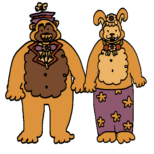
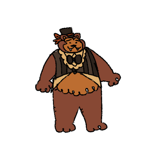
using this as an excuse 2 show the concept art for the main 4 gang + fredbear and spring bonnie + the chaotic children trio…. the fredbear design is outdated but everything else is up to date


My take on inkfishes
probably an unpopular opinion but i still think Splatoon 1 has the best graphics style in the series
the graphics were so much moodier and darker, shadows were really prominent giving it a much more gritty and realistic feel


The far-off environmental elements had a nice blur that gives them a bit of a dreamlike quality IMO.


I know the top picture is a sunset level, but; seriously is it just me? Why is everything in Splatoon 2 SO CRISP AND BRIGHT AND NEON? I talked about (probably 2 years ago at this point) how Splatoon 2 feels like it's an evolution and commercialization of Turf Wars into a product and a brand rather than how in Splatoon 1 they had a much more backstreet, discreet, shady feeling. And I feel like the graphics carry that over weirdly enough.
But most importantly, the ink and the Inklings themselves; ever since Splatoon 2 came out and people started going "omg the ink looks so good now!" i. literally never agreed with that. even with Splatoon 3 i STILL THINK the ink looks the best in Splatoon 1. In Splatoon 2 and 3, they have really been leaning into making the ink extremely neon and super saturated, and I don't think it looks great. I can't really even pinpoint the difference here (especially not with the Inklings themselves, but).


(Splatoon 1 above, Splatoon 2 under)
The Inklings in humanoid form don't stray away from having dull or dark colored tentacles in different lighting conditions, and even the ink itself is nowhere near as saturated as it is, leaning more into quieter or pastel tones. Again, it makes it look nice paired with the darker graphics of the game, and somehow it feels really at home and pretty natural? The difference in the model of the Inkling itself is also a mystery of me, it might be a case of less shading or less specular making it look flatter and that's more pleasing to the eye than how shiny they are nowadays, ESPECIALLY in Splatoon 2. The ink is notably flatter than it is in newer games, and if it wasn't obvious I definitely think it still just, looks the best? Don't ask me how. (The squids also look amazing. Like gummy.)


just thought about putting that out there. Anyone else's thoughts on the games' graphics?


wuuh huuuh i am posting some old stuff here i wanna be more active tbh
silly animatronics

blue loves to kiss mann
also all of the clouths are pattern on his body and the hat is a blub he is organical :3333

Mire of them!!! MORREE OF THEM!!!

friday in tableturf :3

The Afton kids + MCI kids circa 1984-85
Closeups under cut bc tumblr has murdered the image quality:


-
 tigersbloodmantis liked this · 8 months ago
 -
 my-favorites-suffer liked this · 9 months ago
 -
 thethirdbomb liked this · 10 months ago
 -
 roxanneslosteyes reblogged this · 10 months ago
 -
roxanneslosteyes liked this · 10 months ago
-
 nightmarebonnieplaya liked this · 10 months ago
 -
 pokenerd265 liked this · 10 months ago
 -
 oceansreducedtoshallowcreeks liked this · 10 months ago
 -
 therealjackdsaf reblogged this · 10 months ago
 -
 callme-cursed reblogged this · 10 months ago
 -
callme-cursed liked this · 10 months ago
-
 octorocktopus liked this · 11 months ago
 -
 glamrocktiger liked this · 11 months ago
 -
 misterdoccy reblogged this · 11 months ago
 -
misterdoccy liked this · 11 months ago
-
 cheezbot liked this · 11 months ago
 -
 foxyzorro liked this · 11 months ago
 -
 fazbear-entertainment-archive reblogged this · 11 months ago
