
Sylwester | i will mostly post sketches, because i'm too lazy to end them
196 posts
Latest Posts by nastysynth - Page 6


Really crappy/quick tutorial on how I draw muscles?
I tend to draw muscles very simply, and there are tons of other tutorials that are waaaaayyyy better! But I hope you enjoy yungterra!
shading colour tips
hey yall its me the Art Mom™ to help you shade pretty
rule 1: DO NOT SHADE WITH BLACK. EVER. IT NEVER LOOKS GOOD.
red- shade with a slightly darker shade of purple
orange- slightly darker and more saturated shade of red
yellow- i think like..a peach could work but make it a really light peach
green- shade with darker and less saturated shade of blue or teal
blue- shade with purple
purple- a shade thats darker than the purple you’re using and maybe a little pink (MAYBE blue)
pink- darker shade of red
white- a really light lavender or blue..or i guess any really light colour??
black- okay listen dont use pure black to colour anything unless you want to leave it with flat colours because you cant really shade black lol
grey- a slightly darker shade of purple or blue (less saturated)
brown- slightly darker and less saturated shade of purple or red
aaaaand thats all i got lol. let me know if there is anything i should add to this list!!
Do you any tips about using ms paint?
I think I have few tips
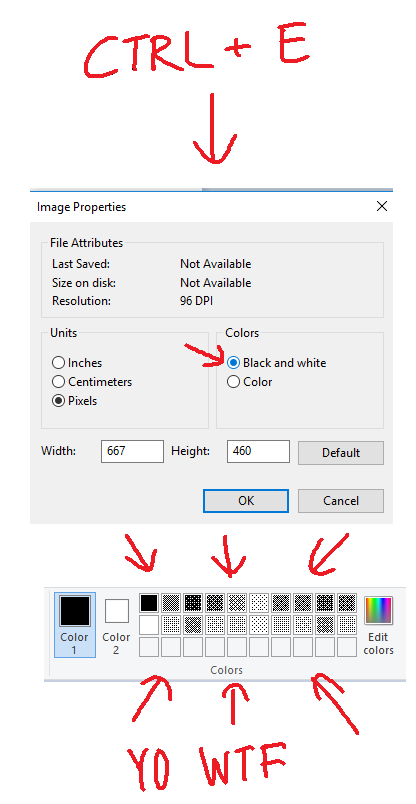
#1Use 500x500 px or bigger canvas size. Any smaller size will make a brush look messy and shit.Here look:
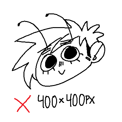

Can you see the difference?? Lineart in 600x600 px is so much smoother
#2

#3

#4 RIGHT MOUSE BUTTON YOU NEED IT

#5

*:・゚✧it’s like manga : *✧・゚
that’s all tbh
i hope this was somewhat helpful
how do you make ur art look like its glowing?? it's gorgeous!!
I’ll give you a weird secret. After you put the glowing object on a dark background, surround the white parts with a halo of highly saturated color. Observe:

It doesn’t have to be that blatant- smaller outlines of color, blended properly with the background, can make an equally effective glow-y look :)

Custom brush tutorial kinda??
Heres how you can make pixel brushes in Clip Studio Paint
first make a little pixel pattern and made sure that the background layer is transparent.

then you want to select edit -> register material -> image. this i remember from trying it before

next name it and choose a place for it to go among the others. doesnt matter where really. also check the texture box.

next to make the brush choose whatever brush that youd like to give it that has the properties you want and copy it. i just chose the standard oil brush. go to the copied brushes settings and click texture

click where it says none and find the brush that you made. after you click it change the setting to this

for me the texture works for subtract, multiply and compare. dont really know the differences between them all or form the others but for what i wanted those three seemed to work.
i did this for a bunch of different pixel patterns and brushes and got some cool effects! check it out!

i appreciate all the help and suggestions yall gave me!

maybe once i figure them out some more i could offer stylized commissions with them :V

Some people were curious how I finish my 1H sketches so here’s a little tutorial ✨
Ps: just keep in mind that this is the result of super concentrating for 60min just drawing nothing else.
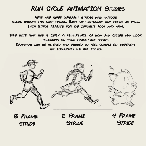
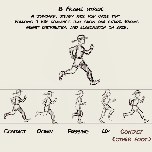
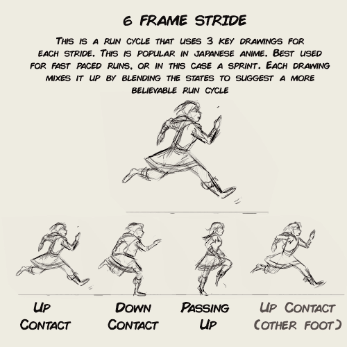
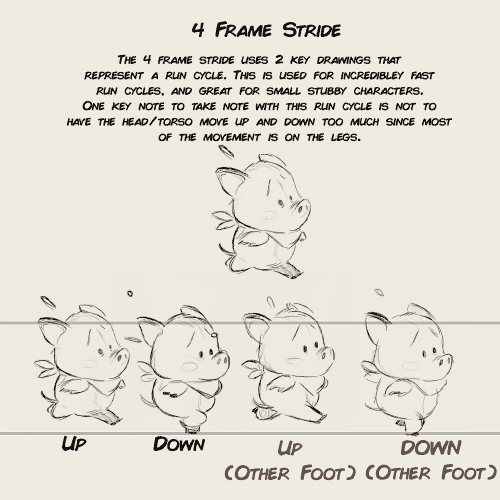
animation run cycle notes for my upcoming 2D animation video course package


here’s a super quick wing tut for a friend who really wants to draw the bird dude from BNHA.
some more resources if u guys want more detailed tutorials:
https://www.deviantart.com/key-feathers/art/Bird-Wings-Tutorial-201057544 https://www.deviantart.com/sunstategalleries/art/Wing-Tutorial-259588840 https://www.deviantart.com/windfalcon/art/Wing-Tutorial-7915972 https://www.deviantart.com/windfalcon/art/Realistic-Wing-Tutorial-II-31471478

Absolutely!!
Muzzles are one of my favorite parts of drawing animals/furry characters & really fun to draw expressions for. I always start to draw long muzzled characters the same way, by drawing two circles, one representing the basic shape of the head, and the second where the basic placement of the nose is going to be.

From there I sus out the basic shapes without worrying about details. things like the mouth and nose details I always add in last, since theyre less important in the sketching stage than the basic shapes.

For open mouthed or front-view muzzles I basically always use the same process.
This same process also works for shorter muzzled characters as well

It took me a while to get good at drawing muzzles from different angles & stuff, but once you figure out a good method that works for you its WAY easier than it seems. the most important part of drawing muzzles is just understanding the shape of your characters face.
I hope that was helpful! I dont usually make tutorials but I tried to make this as clear as I could, my sketch process is pretty messy lol.
Not the same Anon, but hyacinths please
Hi friend, thank you so much for your interest! I’m going to go over how I draw these flowers, but I realized midway that I’m actually very terrible at drawing these in particular, haha. There’s a reason I’ve lowkey avoided doing them so far, and I think it enabled me to highlight a bit more, the way I choose my arts.
It’s quite hard to teach just “how to draw a specific flower” mostly because I myself don’t know - the most important thing I can emphasize is using references!

I personally dislike drawing these flowers in my art, and I couldn’t figure out why until I started this tutorial.
One thing I tend to notice when I look at reference pictures is how flowers move as a ‘whole’ and their relative ‘flexibility’. I pay attention to that because the way I do art, I choose the flower in part based on appearance and how natural they will look in a specific composition.

I tend to like flowers that sprout outwards and have a kind of ‘loose’ appearance. The red lines here show the ‘direction’ I want the flowers to go in.

This is where these flowers pose a bit of a problem. Because arranged in clumps, they are very stiff. It’s not a bad thing if that’s what you’re looking for, but it’s not what I wanted, exactly, for this image.

They just stick straight up, because they have very stiff leaves and a tight packed pattern. (They sometimes tilt though, mine always did). At this point, I could decide the form isn’t right, and this isn’t the flower I want. But there’s also another thing I could do, which is altering it’s appearance when I draw it, slightly.

Left is a simplified version of the shape, while the middle is a more detailed image. The furthest to the right is a close-up of a single flower. Depending on what you want to portray, you can choose to alter what you want your flowers to look like.

As you can see, when drawn closer up, the flower has a lot more flexibility!

So with this, I ended up drawing the batch of flowers a lot larger than how it would be normally, while still retaining the recognizable flower and leaf shape.
So what I’m trying to convey is that sometimes you have to study references, but then know you can pick and choose what aspects to highlight in your art. That’s I think, how you can get your flowers to look extra ‘dynamic’ in your work - by accentuating their specific shapes to work to your advantage! And also playing with their colors and such! But hyacinths come in so many colors that any would work!
I hope this is helpful to you, anon!
any tips on how to start out drawing? I'd love to be able to just start being able to doodle characters and have them actually look like that character but I'm sh*t at anything arty lmao
Every time I get a message like this I wonder what’s the thing the person wants to hear. Everything needs time. It’s highly unlikely that a couple of tips will make you draw better right away. But here are some suggestions about what to do.

Keep reading
Quick art tip - child proportions
Ok this is a real quick one but let me show you how to get more-or-less accurate sizes for child characters. Kids are tricky to draw, they are - from toddler up to about teens people change radically almost every year so pinpointing character’s size during those years is pure hell.
What you need to do to make everything super easy for yourself is to check their Head Proportion. What makes kids look like - well, kids, is that their heads are proportionally large in comparison to their body.
Average adult is about 7,5 heads tall in comparison to their own body, however with children under 10 that number is just under 6 heads with about 1 head shorter the younger you go down to 3 heads as an infant.
Easiest way to figure the so-so head-height of a certain age is to find images of said age group and do a quick count on them

at which after you can replicate it in your own works - don’t mind if it’s not 1:1 with reference, finding images that are actually of the age you need is tricky and kids in general vary a lot so someone might be a lot taller than others. You have a bout 0,5 -1 heads of wiggle room before it starts to look way older.


Proportions are super important in art and i lovingly recommend everyone to figure out basics of them - it’s the easiest way to get notifically better with art. I could go on about proportions but let’s wrap this up. Need to note however that head proportion is not same as character height - a character can be 15 feet tall but still have head-height of 6, HH is simply a way to scale out the body.
i literally love how your color and shade if it’s ok do you have any tips on digital coloring? you don’t have to answer this if you don’t feel like it :) thanks!!
hello friend!! i have a tutorial i made on twitter a while ago which is more or less how i make my colours more interesting. i still use the technique and in general it’s just a lot of colour adjustment nothing too special LOL here!!


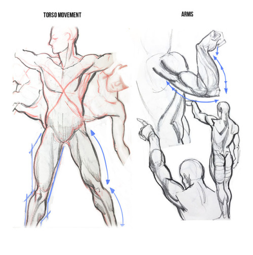
how to draw arms ? ?
teach me?? how to draw?? the action of kissing????


Step 1. yearn

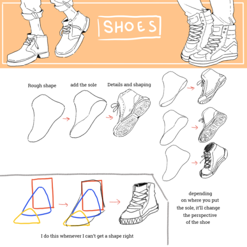

Disclaimer: I’m completely self taught so my art is not necessarily anatomically correct nor realistic. This is just how I personally draw shoes.
Chunky Big Shoes !! Shoes are one of my absolute favorite things to draw so I’m glad you like how I draw them! these are the only real tips I have lmao. I always just make a vague shape (sorta,,,looks like a cartoon steak or smthn) and then draw the shoes.


Hi there! Hope you’re having an amazing day as well! :D Here are some tutorial sketches on how I approach drawing male and female characters, and Handsome Jack. I tend to focus on varied uses of curves and angles when drawing male or female characters. Hope this helps!
Quick art tip - child proportions
Ok this is a real quick one but let me show you how to get more-or-less accurate sizes for child characters. Kids are tricky to draw, they are - from toddler up to about teens people change radically almost every year so pinpointing character’s size during those years is pure hell.
What you need to do to make everything super easy for yourself is to check their Head Proportion. What makes kids look like - well, kids, is that their heads are proportionally large in comparison to their body.
Average adult is about 7,5 heads tall in comparison to their own body, however with children under 10 that number is just under 6 heads with about 1 head shorter the younger you go down to 3 heads as an infant.
Easiest way to figure the so-so head-height of a certain age is to find images of said age group and do a quick count on them
at which after you can replicate it in your own works - don’t mind if it’s not 1:1 with reference, finding images that are actually of the age you need is tricky and kids in general vary a lot so someone might be a lot taller than others. You have a bout 0,5 -1 heads of wiggle room before it starts to look way older.
Proportions are super important in art and i lovingly recommend everyone to figure out basics of them - it’s the easiest way to get notifically better with art. I could go on about proportions but let’s wrap this up. Need to note however that head proportion is not same as character height - a character can be 15 feet tall but still have head-height of 6, HH is simply a way to scale out the body.
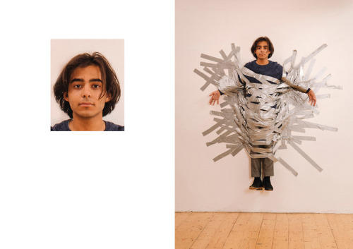
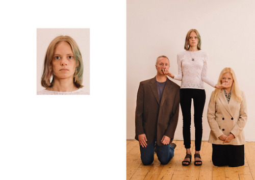
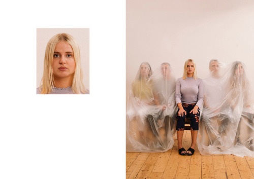
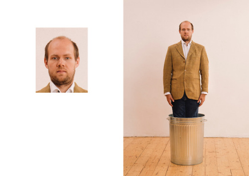
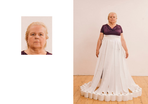
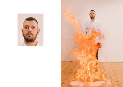
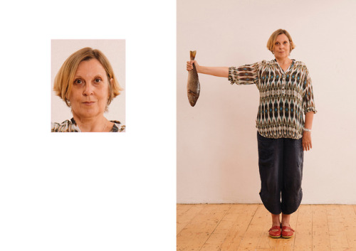
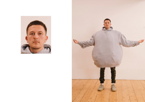
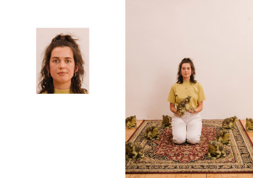
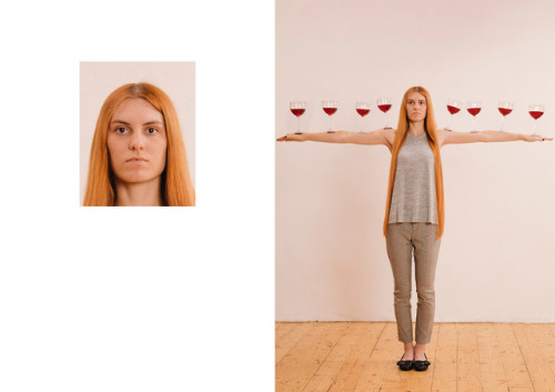
Passport Photo Series London-based visual artist Max Siedentopf recruited a cast of friends and strangers to sit for passport photos. Above the shoulders the participants are straight-faced and rigid, yet below they are balancing full wine glasses along their arms, taped to a wall, or even on fire.

Hi there!! First off thanks so much for spending all that time!!
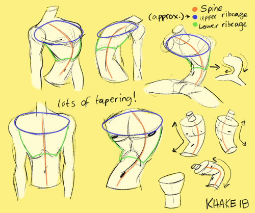
To be honest I’m still trying to get comfortable with anatomy….however I do have a lot of fun making bendy torsos (thanks to Junkrat’s horrible posture) and I think I’ve stylized them enough to make a tutorial on them.
I almost always start my drawings with a C-curve/S-curve to mark the spine, this way I can exaggerate the torso as much as I like. Notice though that in the GIF the C-Curve isn’t actually where the spine is, it’s more of a way to feel the flow of the drawing.
So anyway yeah!!! I hope this helped in some way?? Sorry if it’s not extensive, I’m still learning a lot!! And thanks for the ask, I appreciate the love <3


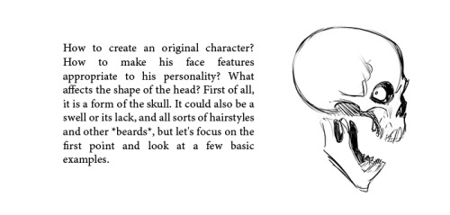
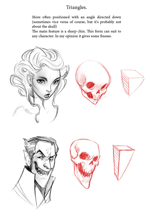
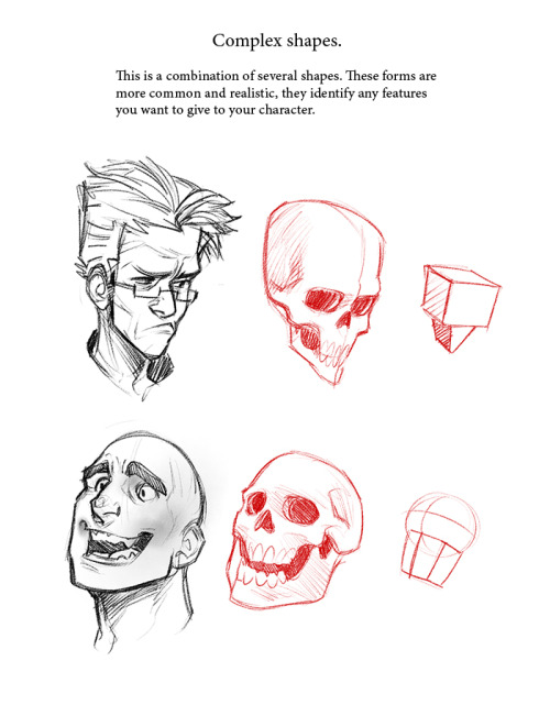
For the anon who asked me about tips on drawing faces, hope this helps!
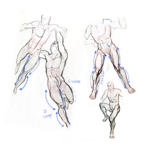
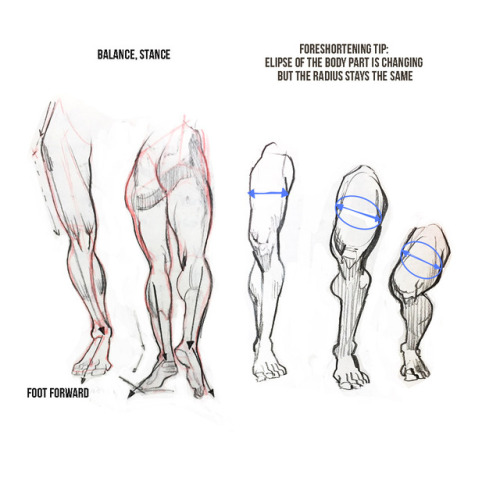
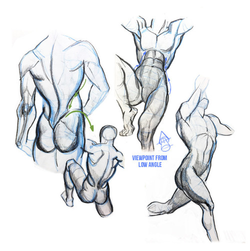
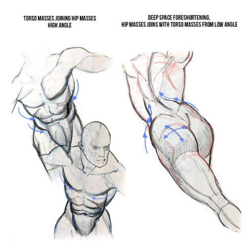
My opinion about Burne Hogarth’s ‘Dynamic figure drawing’
Some sketches and notes.
If you are artist that wants to learn anatomy or beginner artist and you are confused which resources to use to learn human figure you might find post helpful.
This is my take on the book and I want to share some thoughts after reading the book and practicing the topics. There are good things and thing I didn’t like and wouldn’t recommend. Just to give you answer to the question if I liked the book. Yes I liked it. But I want to give you honest opinion on good and not so good things so you as a student or always learning artist can decide if you want to use this book to learn. Let’s start with things I liked. It’s a book that covers unique topic: drawing figure in deep space and drawing without reference. I also liked that it doesn’t represent academic approach. Author rather helps people who had academic background and still have problems with drawing figure that isn’t standing straight like soldier. This book can help you fight stiffness in poses and helps generate ideas for dynamic poses. It teaches you how to draw figure in deep space, meaning : helps you create illusion of depth. Approach to drawing human body is also interesting. Hogarth recommend starting from torso and then adds secondary forms : limbs. This books helps you understand body curves so you don’t need to know anatomy. Actually this is something I like and at the same time I am not sure about. It’s good to know anatomy first before you get into this book. I would say that perfect audience for this book is student who has academic background but can only draw people standing straight like soldiers. Hogarth’s books will help you to invent interesting forms and positions. Although you can’t take his anatomy literally. He has very characteristic style, that isn’t realistic but is believable. “Dynamic figure drawing” many covers male body and there’s very little about female body. It’s because female body just doesn’t look good. It’s like female’s version of male bodies. Doesn’t look very organic and remind me of ancient greek statues. Just to give you example : breasts looks like they are balls attached to the chest. Definitely look for some other source about female body. Overall you can find some great tips and topics that are not covered in other books. This book is for already experienced artists who wish to learn techniques that will expand their academic knowledge. For anatomy look at Bridgman and Loomis 😃 I tried to keep this review as short as I could. Let me know how do you like these kind of reviews and if you would like to see more post like this one in the future.


All images are used purely for educational purposed and are credited to their sources and owners. Any image without credit was created by me.
Quick art tip - child proportions
Ok this is a real quick one but let me show you how to get more-or-less accurate sizes for child characters. Kids are tricky to draw, they are - from toddler up to about teens people change radically almost every year so pinpointing character’s size during those years is pure hell.
What you need to do to make everything super easy for yourself is to check their Head Proportion. What makes kids look like - well, kids, is that their heads are proportionally large in comparison to their body.
Average adult is about 7,5 heads tall in comparison to their own body, however with children under 10 that number is just under 6 heads with about 1 head shorter the younger you go down to 3 heads as an infant.
Easiest way to figure the so-so head-height of a certain age is to find images of said age group and do a quick count on them
at which after you can replicate it in your own works - don’t mind if it’s not 1:1 with reference, finding images that are actually of the age you need is tricky and kids in general vary a lot so someone might be a lot taller than others. You have a bout 0,5 -1 heads of wiggle room before it starts to look way older.
Proportions are super important in art and i lovingly recommend everyone to figure out basics of them - it’s the easiest way to get notifically better with art. I could go on about proportions but let’s wrap this up. Need to note however that head proportion is not same as character height - a character can be 15 feet tall but still have head-height of 6, HH is simply a way to scale out the body.


My old tutorial! Wanna share it with you)
I have two questions! First: have you ever thought of doing a tarot card suit for your characters? I think it'd work really well for them! And two: help me how do I draw legs
@gravitality
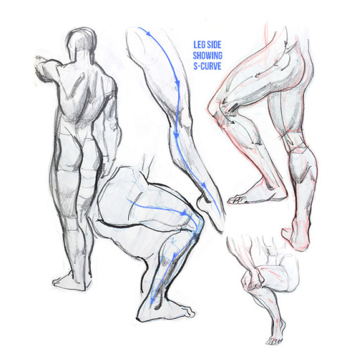
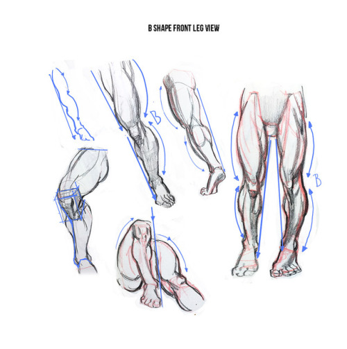
Hi!! I’ve absolutely been thinking about that, yeah, in fact I recently talked about that to my boyfriend just recently. It’ll likely happen after october! And to answer your second question! I made a thing on legs that i hope you’ll find useful!!
So. I’ve already explained basics on legs here, but I don’t think it hurts to go through some extra details to help you understand legs some more.

The very basic thing is to imagine legs as teardrops. Again, this has already been covered in said tutorial above, but I figured it’s still good to mention even the most basic thing that I know of. I still highly recommend you check it out to get in more detail and to see some other examples and practices that you do. But basically, think of legs in the shapes of teardrops, when it comes to shape. If you need a simple stick-figure to connect the legs in the first place, make sure that they bend at the knees a bit so that the legs don’t come off as stiff and unnatural.

As you can see, this method works perfectly for realistic legs as it does for stylistic ones. Remember to use these as a guideline, never to be the exact base of the legs you will be drawing. If you draw traditionally, remember not to draw these guides too hard, or they will be hard to erase/do freestyle!

But how do you actually draw out the legs without drawing them perfectly straight, as shown to the left? The trick is to add volume to them, and how you do that can be winged to your own liking. The idea is to think in curves. As no leg is perfectly straight. You may make these curves minimal if you don’t want them to be curvy, but keep in mind, still, that not even your own bones are perfectly straight, so it is highly recommended that you make them bend, at least a little.

It all depends on how you draw them as well. Say you put your legs together, as shown in this picture, what happens to the fat and muscle? Naturally, they press together, much like how thighs squish on the surface when you sit down (I’m sure most people know what I’m talking about). Make sure this shows in your art! This is very important to keep in mind, because it makes it all look more natural and believable. Try to cross your legs or stand up and sit down again for real-life examples!


The same applies for stretching your legs, more or less, except they appear to become more ‘hollow’ and slimmer. They become less soft to the touch, too, and might show. Try stretching your legs and feel where the muscles tense and where it feels ‘hollow’. This is very helpful with your art.

Many leg tutorials talk about legs without mentioning the behind. It requires a tutorial on it’s own, in all honesty, but this is the most simplest way to draw it connecting to the legs. Remember that it comes in many different shapes, and this is just a super basic guide! Two circles overlapping, while following the line and flow of the legs. Remember the muscle/fat as mentioned above!

Okay, so we got the basics of leg shapes figured out? What if you want o draw them in a certain pose, or with a certain silhouette, but perhaps do not have the reference for it? Or you want to blend your style into it? The key is to not shy away from doodling the form. Make mess, draw lightly and don’t care about the anatomy. That way you’ll get everything down without it appearing stiff. You can clean up the sketch later, always, and if you can, use a reference after you have drawn your pose, to correct your drawing.

Remember that the hips do a lot to the pose of the legs! Make sure they are in flow with your legs, so that it can look more natural. Remembers that hips ‘rotate’ with the spine.

I’ve talked about this method before when it comes to posing, and the same applies for the legs. One way to make legs appear ‘steady’ is to picture them standing in a line, and one of those legs need not to stray from the lines too much, making it steady. If you want a dynamic pose despite the steady pose, you can always have the other leg stray from the line, since it only matters that one leg is steady. This method can create good, casual poses without making them appear boring. (also notice how the teardrop shapes are used here, despite the highly stylized legs)

Do you want a highly dynamic pose, or them to appear unsteady, then skip the line entirely and make both legs aim away from it completely. As you can see, the legs appear more moving, in action, as if they’re fighting, falling, or dancing. As you can imagine, this is not a pose that one could stay steady on, suggesting that it’s taken mid-movement. More about posing and this ‘line’ method is talked about in this tutorial.
Hope this helped you, if you have any questions let me know, and if you’d like to check out all my tutorials they can be found here!


they took my best friend…
he’s in the forest.
eerie crests, a webcomic by @littlestpersimmon! it’s so cool yall go check it out!
So

Can we just……

Talk about………

All of……………

The…………………….


Similarities??????????????????

hope sal comes back
